Note
Go to the end to download the full example code.
Line (Advanced)
Line chart — advanced template (event window + peak annotation).
Source: dartwork_mpl/asset/prompt/05-templates/advanced/line.py ·
MCP dartwork-mpl://template/advanced/line.
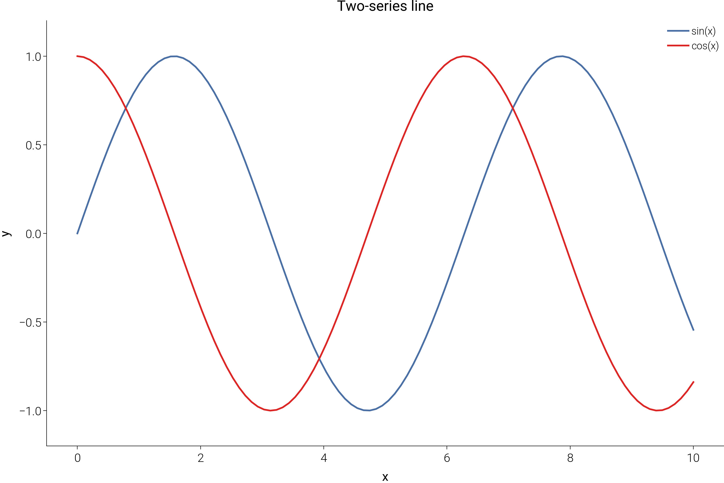
[VISUAL] 💡 TICK_DECIMAL: Y-axis[0]: trailing zero in integer tick labels (example '100.0')
[VISUAL] ⚠️  TEXT_CONTRAST: Text contrast 1.80:1 is below the 4.5:1 AA threshold for normal text (sample: 'Product v2 launch')
[VISUAL] ⚠️  TEXT_CONTRAST: Text contrast 1.81:1 is below the 4.5:1 AA threshold for normal text (sample: 'Peak: 175 Month 24')
[VISUAL] 💡 TEXT_CONTRAST: Text contrast 3.32:1 is below the 4.5:1 AA threshold for normal text (sample: 'Synthetic monthly cohort, 24 months —...')
[VISUAL] ⚠️  TEXT_CONTRAST: Text contrast 2.07:1 is below the 4.5:1 AA threshold for normal text (sample: 'Source: synthetic monthly KPI series ...')
[VISUAL] 💡 GRAYSCALE_SAFETY: The project modeled-relative-Y proximity heuristic before compositing found source-RGB pairs below its ΔY threshold; inspect ΔEOK separation: #30d9aa/#ffbb50

=== FIX SUGGESTIONS ===

TICK_DECIMAL: Y-axis[0]: trailing zero in integer tick labels (example '100.0')
  Option 1:
    # Match tick precision to the tick step
    ax.yaxis.set_major_formatter(mticker.StrMethodFormatter('{x:.0f}'))
  Option 2:
    # Or let matplotlib choose compact numeric labels
    ax.yaxis.set_major_formatter(mticker.ScalarFormatter())
[VISUAL] 💡 TICK_DECIMAL: Y-axis[0]: trailing zero in integer tick labels (example '100.0')
[VISUAL] ⚠️  TEXT_CONTRAST: Text contrast 1.80:1 is below the 4.5:1 AA threshold for normal text (sample: 'Product v2 launch')
[VISUAL] ⚠️  TEXT_CONTRAST: Text contrast 1.81:1 is below the 4.5:1 AA threshold for normal text (sample: 'Peak: 175 Month 24')
[VISUAL] 💡 TEXT_CONTRAST: Text contrast 3.32:1 is below the 4.5:1 AA threshold for normal text (sample: 'Synthetic monthly cohort, 24 months —...')
[VISUAL] ⚠️  TEXT_CONTRAST: Text contrast 2.07:1 is below the 4.5:1 AA threshold for normal text (sample: 'Source: synthetic monthly KPI series ...')
[VISUAL] 💡 GRAYSCALE_SAFETY: The project modeled-relative-Y proximity heuristic before compositing found source-RGB pairs below its ΔY threshold; inspect ΔEOK separation: #30d9aa/#ffbb50
# ai-template-meta-start
# tier: advanced
# basic_counterpart: line
# use_case: Two-series trend over an ordered x-axis with an event window and peak callout
# difficulty: intermediate
# data_shape: x: list[float], y_primary: list[float], y_compare: list[float]
# tags: line, trend, time-series, event, annotated, narrative
# narrative: Monthly active users vs. industry baseline; product launch window highlighted, peak annotated
# advanced_apis: dm.cspace, axvspan, ax.annotate with arrow, format_axis_si, dm.validate_with_fixes, dm.check_figure_quality
# ai-template-meta-end

import matplotlib.pyplot as plt
import numpy as np

import dartwork_mpl as dm

dm.style.use("scientific")

# Synthetic monthly KPI series (Jan 2024 — Dec 2025) — believable launch story.
rng = np.random.default_rng(42)
months = np.arange(24)
launch_idx = 9  # Oct 2024 launch
base = 100 + np.cumsum(rng.normal(0.5, 1.2, size=24))
product_lift = np.where(months >= launch_idx, (months - launch_idx) * 4.5, 0)
y_primary = base + product_lift + rng.normal(0, 1.0, size=24)
y_compare = base * 0.95 + rng.normal(0, 1.2, size=24)

# Pick two perceptually distinct OKLCH endpoints for the two series.
primary_color = dm.color("dc.teal4").to_hex()
compare_color = dm.color("oc.gray6").to_hex()

fig, ax = plt.subplots(figsize=dm.figsize("14.5cm", "standard"))

# Event window — the launch quarter as a context band.
ax.axvspan(launch_idx, launch_idx + 2, alpha=0.12, color="dc.amber4", zorder=0)
ax.text(
    launch_idx + 1,
    max(y_primary.max(), y_compare.max()),
    "Product v2 launch",
    ha="center",
    va="top",
    fontsize=dm.fs(-1),
    color="dc.amber5",
    fontstyle="italic",
)

# Two series — primary + benchmark comparison.
ax.plot(
    months,
    y_primary,
    color=primary_color,
    linewidth=dm.lw(0),
    label="Our product (MAU)",
)
ax.plot(
    months,
    y_compare,
    color=compare_color,
    linewidth=dm.lw(0),
    linestyle="--",
    label="Industry median",
)

# Annotate the peak of the primary series.
peak_idx = int(np.argmax(y_primary))
ax.annotate(
    f"Peak: {y_primary[peak_idx]:.0f}\nMonth {peak_idx + 1}",
    xy=(peak_idx, y_primary[peak_idx]),
    xytext=(peak_idx - 5, y_primary[peak_idx] + 12),
    fontsize=dm.fs(-1),
    ha="left",
    color=primary_color,
    arrowprops={"arrowstyle": "->", "color": primary_color, "lw": 0.5},
)

# x-axis as months 1..24, no fractional ticks.
ax.set_xticks(np.arange(0, 24, 3))
ax.set_xticklabels([f"M{i + 1}" for i in range(0, 24, 3)])
ax.set_xlabel("Month after series start")
ax.set_ylabel("MAU (indexed)")
dm.format_axis_si(ax, axis="y")

ax.legend(loc="upper left", fontsize=dm.fs(-1), frameon=False)

ax.set_title(
    "Launch quarter shifts MAU growth above industry baseline",
    fontsize=dm.fs(1),
    fontweight=dm.fw(1),
    loc="left",
    pad=18,
)
ax.text(
    0.0,
    1.02,
    "Synthetic monthly cohort, 24 months — divergence opens after the v2 launch.",
    transform=ax.transAxes,
    ha="left",
    va="bottom",
    fontsize=dm.fs(-1),
    color="oc.gray6",
)

fig.text(
    0.01,
    0.005,
    "Source: synthetic monthly KPI series (rng seed 42).",
    fontsize=dm.fs(-2),
    color="oc.gray5",
    ha="left",
    va="bottom",
)

dm.simple_layout(fig, margin=dm.inch(0.08))
dm.validate_with_fixes(fig)

issues = dm.check_figure_quality(fig)
if issues:
    print(f"[line-advanced] quality issues: {issues}")

dm.save_formats(fig, "line_advanced")
Total running time of the script: (0 minutes 0.659 seconds)