Note
Go to the end to download the full example code.
Grouped bar comparison across sites
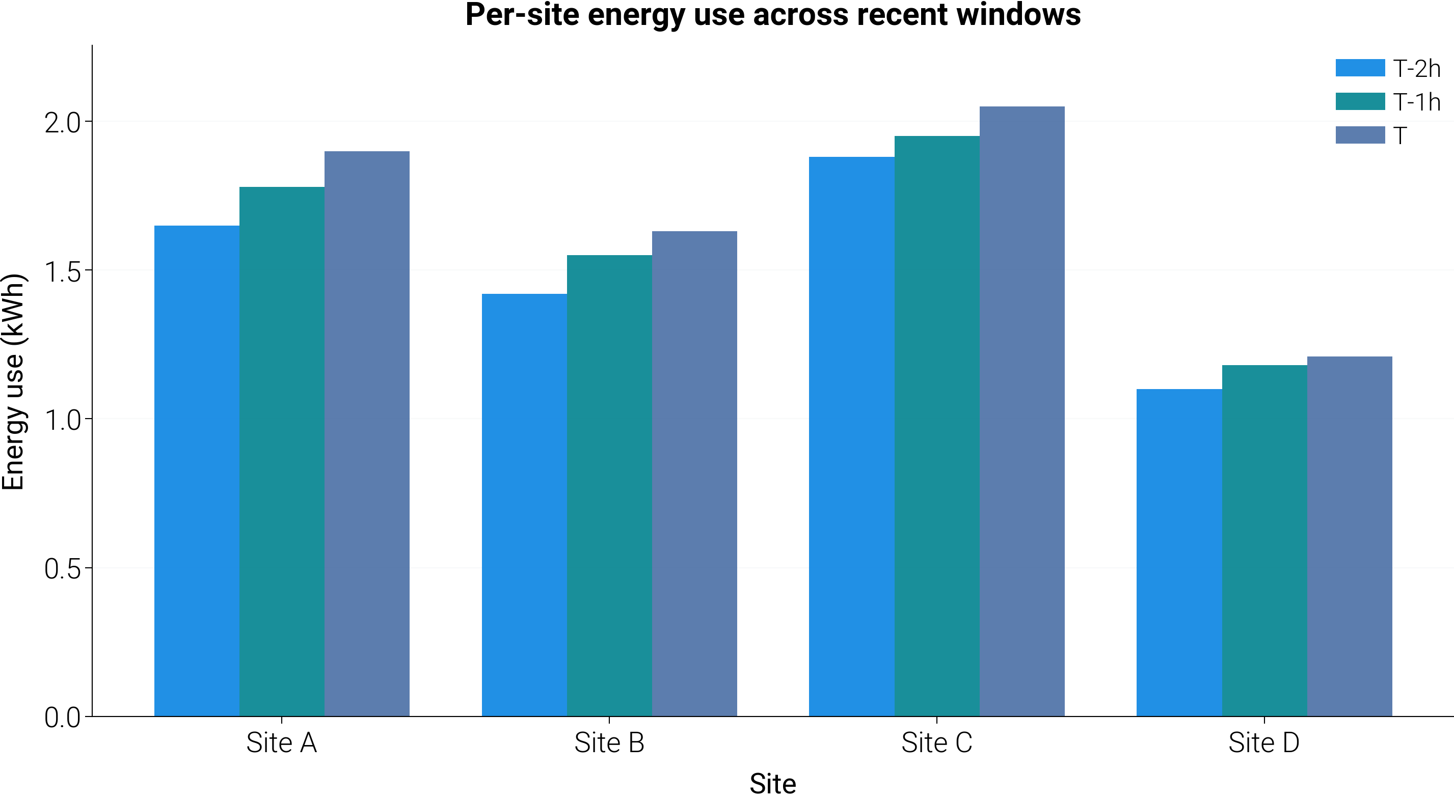
Grouped bar chart that compares a categorical grouping (sites) across several time slices. The legend identifies the time window; the x-axis is the category. Handy whenever both “which group” and “which period” need to be legible at a glance.
import matplotlib.pyplot as plt
import numpy as np

import dartwork_mpl as dm

dm.style.use("report")

sites = ["Site A", "Site B", "Site C", "Site D"]
periods = ["T-2h", "T-1h", "T"]
# rows = sites, columns = periods
measurements = np.array(
    [
        [1.65, 1.78, 1.90],
        [1.42, 1.55, 1.63],
        [1.88, 1.95, 2.05],
        [1.10, 1.18, 1.21],
    ]
)

fig = plt.figure(figsize=dm.figsize("14.5cm", 0.55))
gs = fig.add_gridspec(1, 1, left=0.10, right=0.96, top=0.88, bottom=0.18)
ax = fig.add_subplot(gs[0, 0])

x = np.arange(len(sites))
width = 0.26
colors = ["dc.indigo2", "dc.teal2", "dc.teal3"]
for i, period in enumerate(periods):
    offset = (i - 1) * width
    ax.bar(
        x + offset,
        measurements[:, i],
        width,
        label=period,
        color=colors[i],
        alpha=0.9,
    )

ax.set_xticks(x)
ax.set_xticklabels(sites)
ax.set_xlabel("Site", fontsize=dm.fs(0))
ax.set_ylabel("Energy use (kWh)", fontsize=dm.fs(0))
ax.set_title(
    "Per-site energy use across recent windows",
    fontsize=dm.fs(1),
    weight="bold",
)
ax.grid(axis="y", alpha=0.2)
ax.legend(fontsize=dm.fs(-1))

dm.simple_layout(fig)
plt.show()
Total running time of the script: (0 minutes 0.395 seconds)