Note
Go to the end to download the full example code.
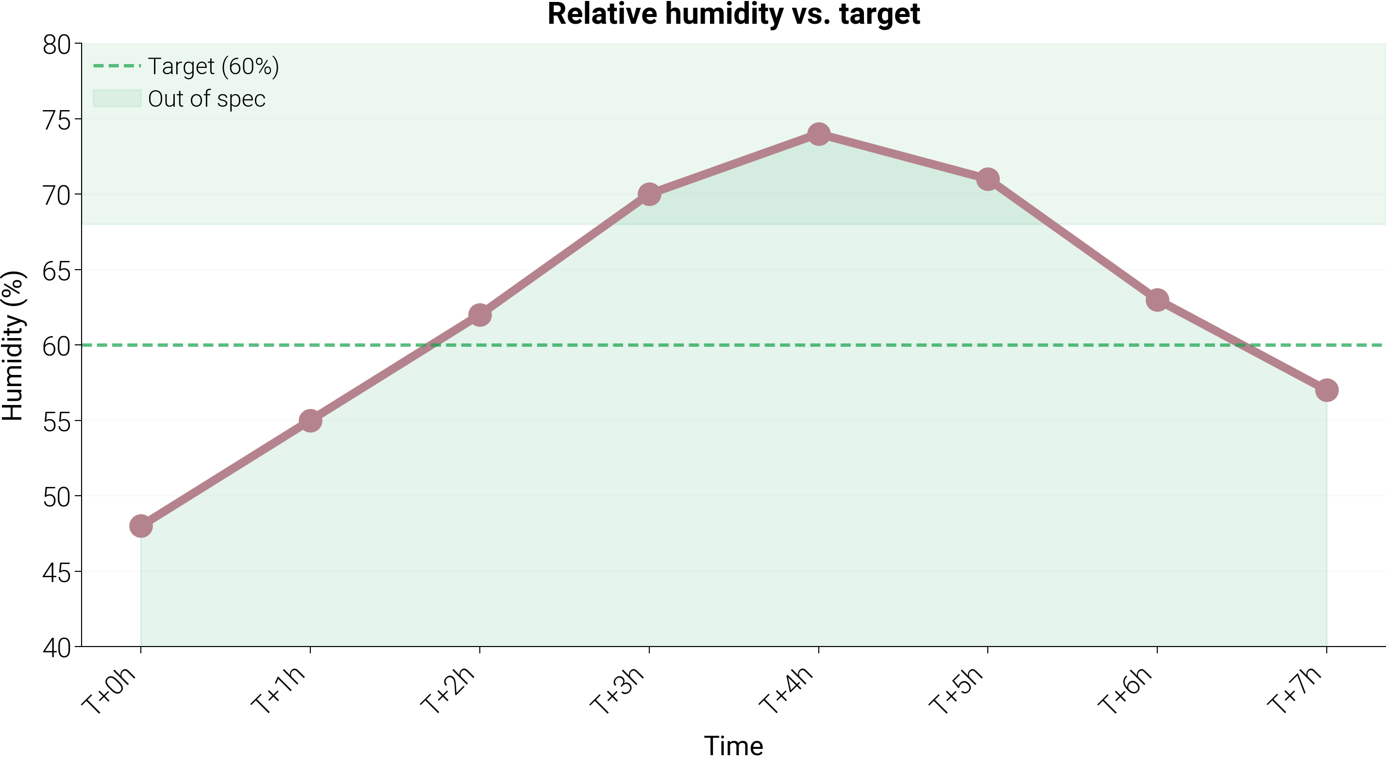
Threshold-annotated trend
Line chart with a filled area under the curve, a dashed reference line, and a shaded out-of-spec band. Useful for drawing attention to where a monitored value crosses an operational threshold.
import matplotlib.pyplot as plt
import numpy as np

import dartwork_mpl as dm

dm.style.use("report")

periods = [f"T+{i}h" for i in range(8)]
humidity = np.array([48, 55, 62, 70, 74, 71, 63, 57])
target = 60.0

fig = plt.figure(figsize=dm.figsize("14.5cm", 0.55))
gs = fig.add_gridspec(1, 1, left=0.12, right=0.96, top=0.88, bottom=0.2)
ax = fig.add_subplot(gs[0, 0])

x = np.arange(len(periods))
ax.plot(
    x, humidity, "o-", color="dc.green3", linewidth=dm.lw(1.5), markersize=6
)
ax.fill_between(x, 0, humidity, color="dc.green2", alpha=0.15)
ax.axhline(
    target, color="dc.red2", linestyle="--", alpha=0.7, label="Target (60%)"
)
ax.axhspan(
    68,
    ax.get_ylim()[1] if ax.get_ylim()[1] > 68 else 80,
    color="dc.red2",
    alpha=0.08,
    label="Out of spec",
)

ax.set_xticks(x)
ax.set_xticklabels(periods, rotation=45, ha="right")
ax.set_xlabel("Time", fontsize=dm.fs(0))
ax.set_ylabel("Humidity (%)", fontsize=dm.fs(0))
ax.set_title("Relative humidity vs. target", fontsize=dm.fs(1), weight="bold")
ax.set_ylim(40, 80)
ax.grid(axis="y", alpha=0.2)
ax.legend(fontsize=dm.fs(-1), loc="upper left")

dm.simple_layout(fig)
plt.show()
Total running time of the script: (0 minutes 0.486 seconds)