Note
Go to the end to download the full example code.
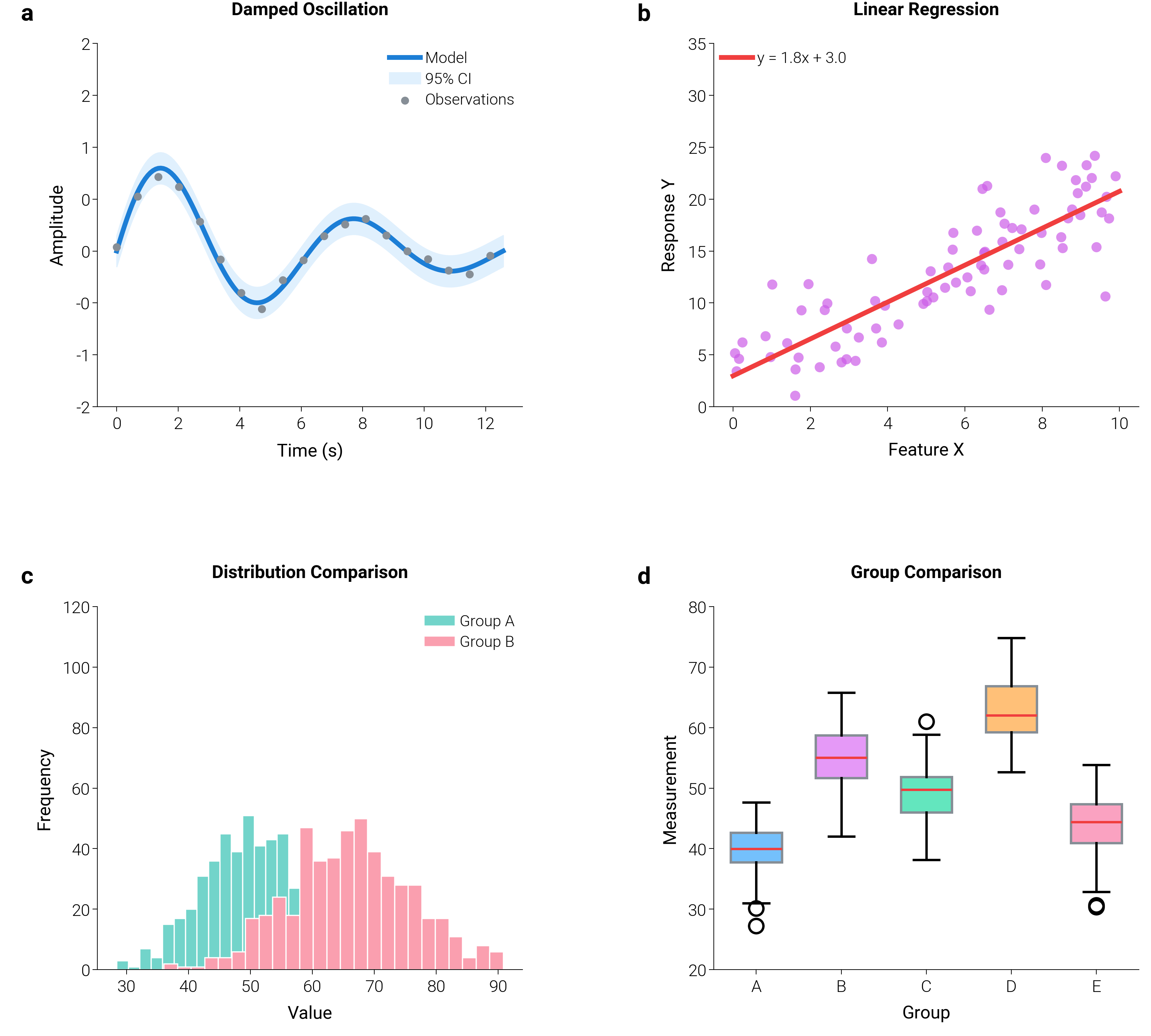
Publication-Ready Multi-Panel Figure
A 2×2 scientific figure combining four fundamental plot types — exactly
as they would appear in an academic paper. Each panel uses the scientific
preset and is annotated with dm.label_axes() for automatic (a)–(d)
panel indexing. Typography is unified via dm.fs() and dm.lw()
scaling helpers.
The 0.4 API path is plt.figure(figsize=dm.figsize(...)) paired with
a custom GridSpec when the inter-panel spacing needs hand-tuning. For a
plain 2×2 with default spacing,
plt.subplots(2, 2, figsize=dm.figsize("17cm", "standard")) is the
one-liner equivalent.
import matplotlib.gridspec as gridspec
import matplotlib.pyplot as plt
import numpy as np

import dartwork_mpl as dm

dm.style.use("scientific")

# 0.4 API: plt.figure(figsize=dm.figsize(...)) for custom GridSpec layouts.
# 17 cm × standard ≈ 6.69 × 5.01 in, the journal-page 2×2 footprint.
np.random.seed(42)
fig = plt.figure(figsize=dm.figsize("17cm", "standard"))
gs = gridspec.GridSpec(2, 2, figure=fig, hspace=0.55, wspace=0.45)

# ── (a) Line plot with error band ──
ax = fig.add_subplot(gs[0, 0])
x = np.linspace(0, 4 * np.pi, 150)
y_true = np.sin(x) * np.exp(-0.15 * x)
y_noise = y_true + np.random.normal(0, 0.08, len(x))
ax.plot(x, y_true, color="dc.teal3", lw=dm.lw(1), label="Model")
band = dm.pseudo_alpha("dc.teal2", 0.15, background="white")
ax.fill_between(x, y_true - 0.15, y_true + 0.15, color=band, label="95% CI")
ax.scatter(
    x[::8],
    y_noise[::8],
    s=8,
    color="dc.indigo3",
    zorder=3,
    label="Observations",
)
ax.set_title("Damped Oscillation", fontsize=dm.fs(0), weight="bold", pad=12)
ax.set_xlabel("Time (s)")
ax.set_ylabel("Amplitude")
ax.set_ylim(-1.2, 1.8)
ax.legend(fontsize=dm.fs(-1), loc="upper right", frameon=False)

# ── (b) Scatter with regression ──
ax = fig.add_subplot(gs[0, 1])
n_pts = 80
x_s = np.random.uniform(0, 10, n_pts)
y_s = 1.8 * x_s + 3 + np.random.normal(0, 3, n_pts)
ax.scatter(x_s, y_s, s=18, color="dc.violet2", alpha=0.7, edgecolors="none")
m, b = np.polyfit(x_s, y_s, 1)
x_fit = np.linspace(0, 10, 50)
ax.plot(
    x_fit,
    m * x_fit + b,
    color="dc.orange3",
    lw=dm.lw(1),
    label=f"y = {m:.1f}x + {b:.1f}",
)
ax.set_title("Linear Regression", fontsize=dm.fs(0), weight="bold", pad=12)
ax.set_xlabel("Feature X")
ax.set_ylabel("Response Y")
ax.set_ylim(0, 35)
ax.legend(fontsize=dm.fs(-1), loc="upper left", frameon=False)

# ── (c) Histogram ──
ax = fig.add_subplot(gs[1, 0])
data1 = np.random.normal(50, 8, 500)
data2 = np.random.normal(65, 10, 500)
ax.hist(
    data1,
    bins=25,
    color=dm.pseudo_alpha("tw.teal500", 0.6, background="white"),
    edgecolor="white",
    lw=0.5,
    label="Group A",
)
ax.hist(
    data2,
    bins=25,
    color=dm.pseudo_alpha("tw.rose500", 0.5, background="white"),
    edgecolor="white",
    lw=0.5,
    label="Group B",
)
ax.set_title(
    "Distribution Comparison", fontsize=dm.fs(0), weight="bold", pad=12
)
ax.set_xlabel("Value")
ax.set_ylabel("Frequency")
ax.set_ylim(0, 110)
ax.legend(fontsize=dm.fs(-1), frameon=False)

# ── (d) Box plot ──
ax = fig.add_subplot(gs[1, 1])
groups = [np.random.normal(loc, 5, 60) for loc in [40, 55, 48, 62, 45]]
bp = ax.boxplot(
    groups,
    patch_artist=True,
    widths=0.6,
    medianprops={"color": "dc.orange3", "lw": dm.lw(0)},
)
box_colors = ["dc.teal1", "dc.violet1", "dc.green1", "dc.orange1", "dc.red1"]
for patch, color in zip(bp["boxes"], box_colors, strict=False):
    patch.set_facecolor(color)
    patch.set_edgecolor("dc.indigo3")
ax.set_xticklabels(["A", "B", "C", "D", "E"])
ax.set_title("Group Comparison", fontsize=dm.fs(0), weight="bold", pad=12)
ax.set_xlabel("Group")
ax.set_ylabel("Measurement")

# Panel labels & layout
dm.label_axes(fig.axes)
for a in fig.axes:
    dm.set_decimal(a, yn=0)
dm.simple_layout(fig)
plt.show()
Total running time of the script: (0 minutes 1.205 seconds)