Note
Go to the end to download the full example code.
Simple Layout: Mixed-Complexity Dashboard
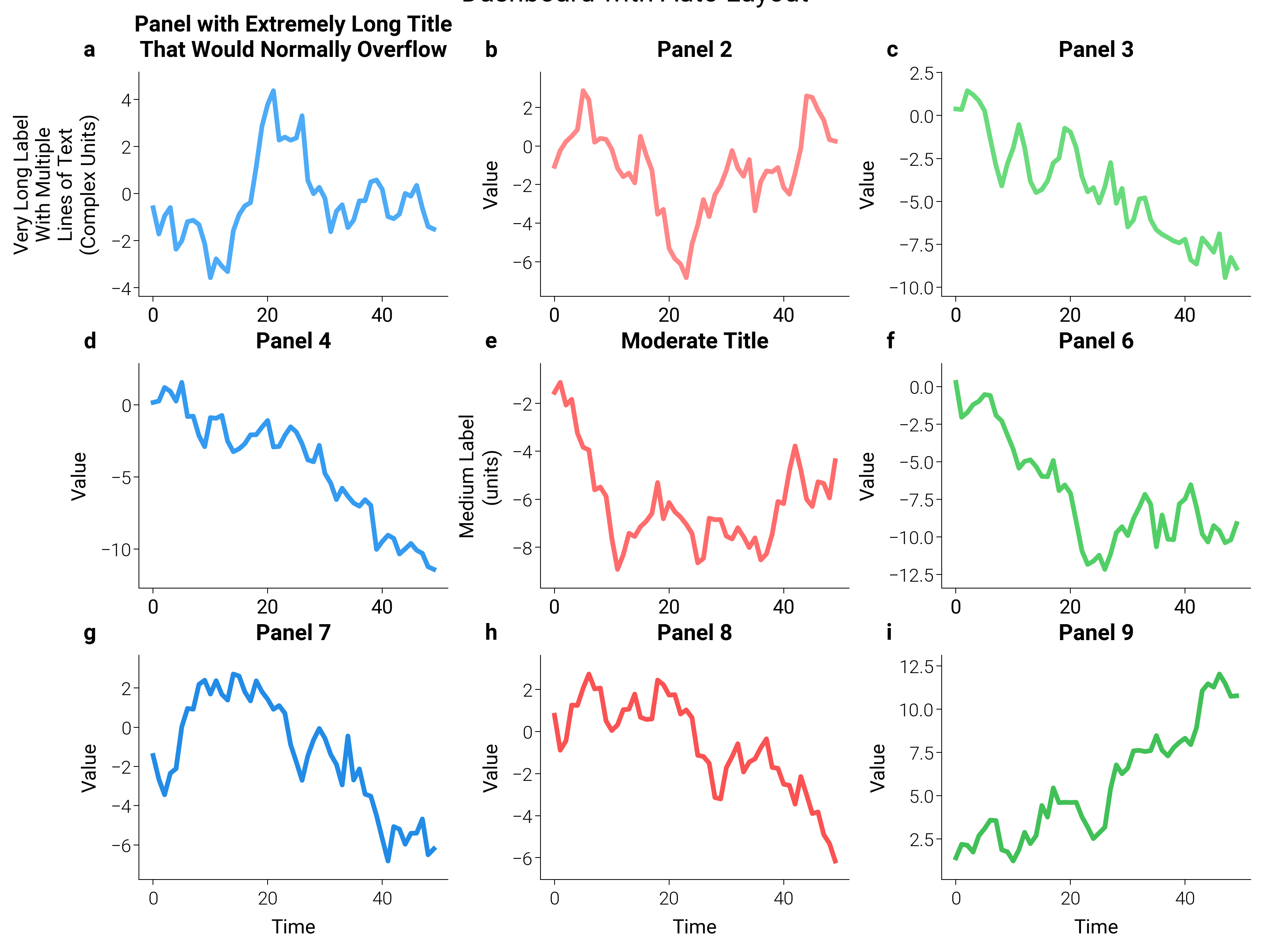
Real dashboards rarely have homogeneous labels. Here a 3×3 grid mixes
short, medium, and very long titles. dm.simple_layout inspects
every visible artist on every axes — texts, titles, axis labels,
view-limited tick labels, axis offset text, and legends — and places
the GridSpec so the union extent sits at the requested margin
from each figure edge. Long labels expand the margins automatically
without wasting whitespace on the simpler panels.
margin accepts a Length
(dm.inch(0.08) here), a unit string ("5mm"), a percentage
string ("2%"), or a bare figure-fraction.
import matplotlib.pyplot as plt
import numpy as np

import dartwork_mpl as dm

dm.style.use("scientific")

# 17 cm × 0.75 ratio (= 12.75 cm tall) stays at the documented
# "oversize-width" ceiling.
fig = plt.figure(figsize=dm.figsize("17cm", 0.75))
gs = fig.add_gridspec(3, 3, hspace=0.3, wspace=0.3)

axes = []
for i in range(3):
    for j in range(3):
        ax = fig.add_subplot(gs[i, j])
        axes.append(ax)

        data = np.random.randn(50).cumsum()
        ax.plot(
            data,
            color=f"oc.{['blue', 'red', 'green'][j]}{4 + i}",
            lw=dm.lw(0.8),
        )

        if i == 0 and j == 0:
            ax.set_ylabel(
                "Very Long Label\nWith Multiple\nLines of Text\n(Complex Units)"
            )
            ax.set_title(
                "Panel with Extremely Long Title\nThat Would Normally Overflow"
            )
        elif i == 1 and j == 1:
            ax.set_ylabel("Medium Label\n(units)")
            ax.set_title("Moderate Title")
        else:
            ax.set_ylabel("Value")
            ax.set_title(f"Panel {i * 3 + j + 1}")

        ax.set_xlabel("Time" if i == 2 else "")

dm.label_axes(axes)

dm.simple_layout(fig, margin=dm.inch(0.08))

plt.suptitle("Dashboard with Auto Layout", fontsize=dm.fs(3), y=1.02)

plt.show()
Total running time of the script: (0 minutes 1.547 seconds)