Note
Go to the end to download the full example code.
helpers — End-to-End Workflow
This example chains every dm.helpers submodule in the order an
automation tool typically needs them: validate the input data,
suggest a chart type from its shape, create a pre-styled figure, pick
colours, render the plot, format axis labels, and finally run a
quality check on the result.
Rendering exactly one figure at the end makes this a natural gallery entry for the “complete workflow” recipe.
============================================================
HELPERS WORKFLOW DEMONSTRATION
============================================================
Step 1: Validating data ...
    validated: 50 points
Step 2: Determining chart type ...
    suggested: scatter_density
Step 3: Creating figure ...
    style: web
Step 4: Selecting colours ...
    palette: categorical
Step 5: Rendering ...
Step 6: Formatting ...
Step 7: Quality check ...
    no issues detected
============================================================
WORKFLOW COMPLETE
============================================================
import matplotlib.pyplot as plt
import numpy as np
import dartwork_mpl as dm
def automated_visualization(
data_dict: dict, chart_request: str = "auto"
) -> tuple[plt.Figure, list[str]]:
"""Build a figure from a raw data dict using the helpers pipeline.
Parameters
----------
data_dict : dict
Dictionary with ``'x'`` and ``'y'`` numpy arrays.
chart_request : str
Type of chart requested, or ``"auto"`` to let
``helpers.quality.suggest_chart_type`` decide.
"""
# Step 1 — validate input.
print("Step 1: Validating data ...")
x, y = dm.helpers.data.validate_data(
data_dict.get("x"),
data_dict.get("y"),
require_same_length=True,
allow_nan=False,
min_points=2,
)
print(f" validated: {len(x)} points")
# Step 2 — pick chart type.
print("Step 2: Determining chart type ...")
if chart_request == "auto":
chart_type = dm.helpers.quality.suggest_chart_type(
x_type="continuous", y_type="continuous", n_points=len(x)
)
print(f" suggested: {chart_type}")
else:
chart_type = chart_request
print(f" using requested: {chart_type}")
# Step 3 — create styled figure.
print("Step 3: Creating figure ...")
style = "scientific" if chart_type in ("scatter", "line") else "web"
dm.style.use(style)
fig = plt.figure(figsize=dm.figsize("17cm", 0.6))
ax = fig.add_subplot(111)
print(f" style: {style}")
# Step 4 — pick colours.
print("Step 4: Selecting colours ...")
palette_kind = "sequential" if chart_type == "line" else "categorical"
colors = dm.make_palette(1, kind=palette_kind)
print(f" palette: {palette_kind}")
# Step 5 — render.
print("Step 5: Rendering ...")
if chart_type == "line":
ax.plot(x, y, color=colors[0], lw=dm.lw(1.5))
elif chart_type == "scatter":
ax.scatter(x, y, color=colors[0], s=50, alpha=0.6)
elif chart_type == "bar":
ax.bar(x, y, color=colors[0])
else:
ax.plot(x, y, "o-", color=colors[0])
# Step 6 — format labels, spines, layout.
print("Step 6: Formatting ...")
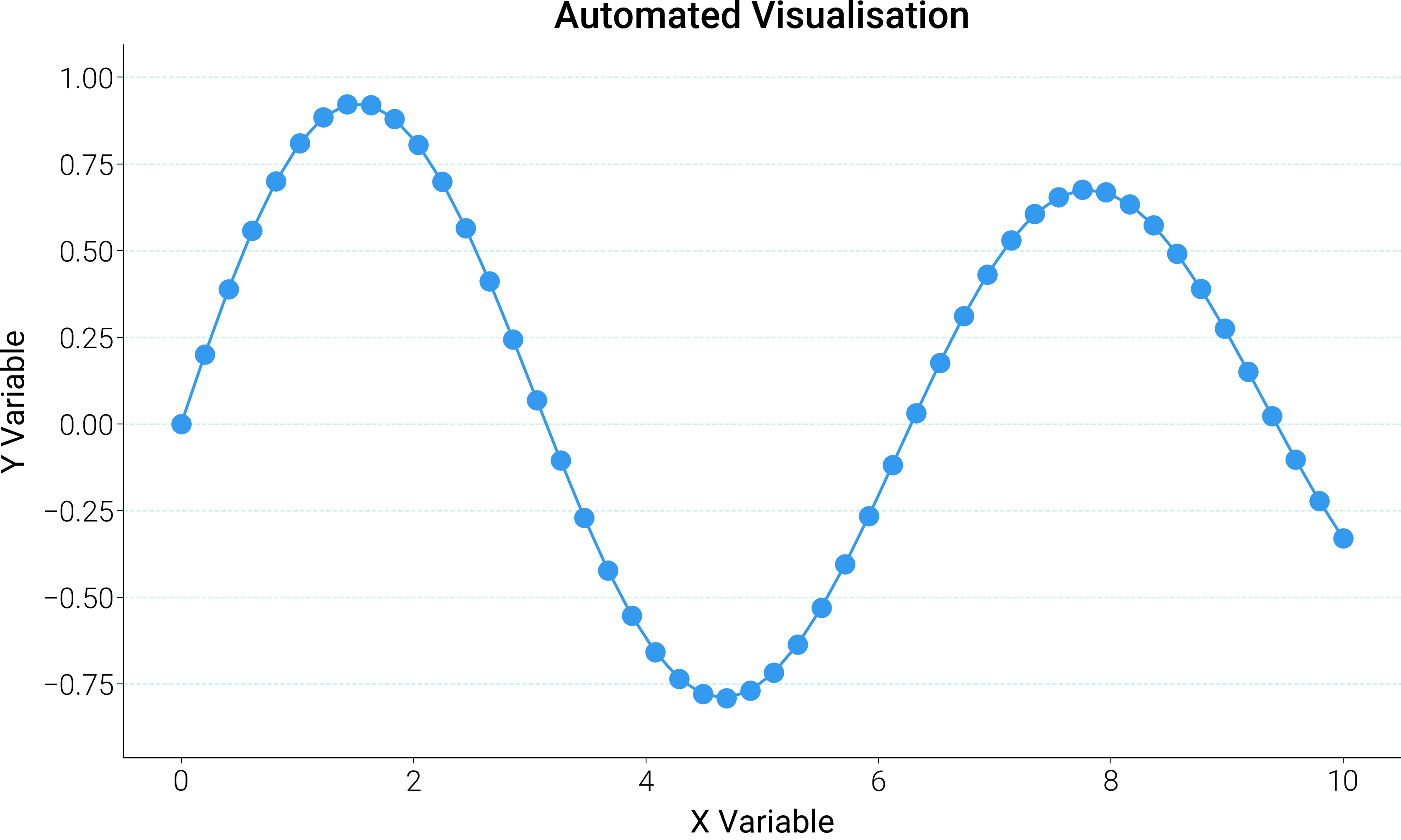
ax.set_xlabel("X Variable", fontsize=dm.fs(0))
ax.set_ylabel("Y Variable", fontsize=dm.fs(0))
ax.set_title("Automated Visualisation", fontsize=dm.fs(2))
# Inline minimal-axes recipe (top/right hidden + light dashed y-grid).
ax.spines["top"].set_visible(False)
ax.spines["right"].set_visible(False)
ax.grid(
True,
axis="y",
alpha=0.2,
color="dc.indigo1",
linestyle="--",
linewidth=0.5,
)
ax.set_axisbelow(True)
dm.simple_layout(fig)
# Step 7 — quality check.
print("Step 7: Quality check ...")
issues = dm.helpers.quality.check_figure_quality(fig)
if issues:
print(" issues found:")
for issue in issues:
print(f" - {issue}")
else:
print(" no issues detected")
return fig, issues
np.random.seed(42)
test_data = {
"x": np.linspace(0, 10, 50),
"y": (
np.sin(np.linspace(0, 10, 50)) * np.exp(-np.linspace(0, 10, 50) / 20)
),
}
print("=" * 60)
print("HELPERS WORKFLOW DEMONSTRATION")
print("=" * 60)
fig, _issues = automated_visualization(test_data, chart_request="auto")
print("=" * 60)
print("WORKFLOW COMPLETE")
print("=" * 60)
plt.show()
Total running time of the script: (0 minutes 0.578 seconds)