Note
Go to the end to download the full example code.
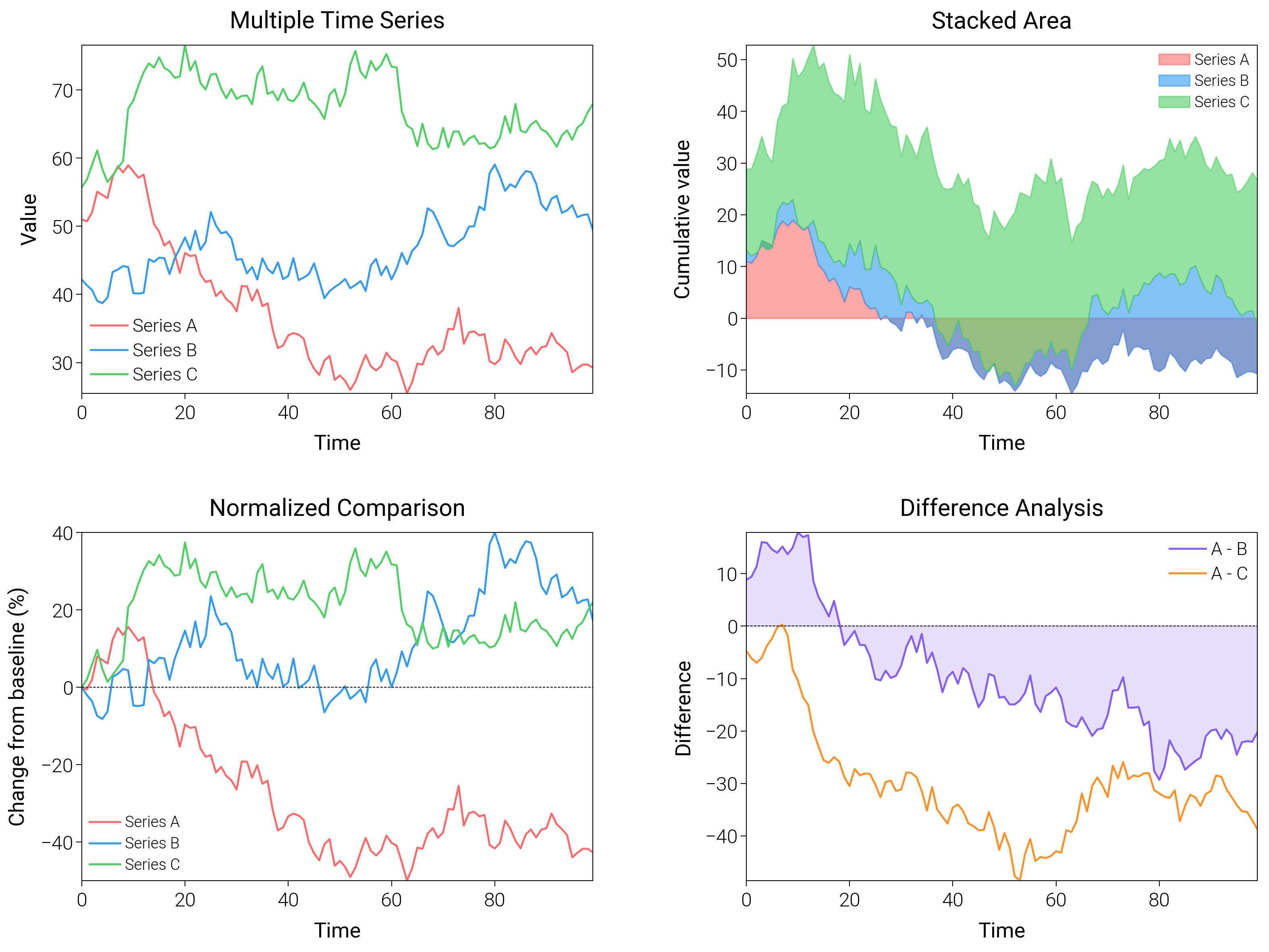
Time Series Comparison
Compare several series with dual axes, panel splits, and color harmonies meant for dashboards.
import matplotlib.pyplot as plt
import numpy as np

import dartwork_mpl as dm

dm.style.use("scientific")

# Generate time series
np.random.seed(42)
n = 100
t = np.arange(n)
ts1 = 50 + np.cumsum(np.random.randn(n) * 2)
ts2 = 45 + np.cumsum(np.random.randn(n) * 2)
ts3 = 55 + np.cumsum(np.random.randn(n) * 2)

fig = plt.figure(figsize=(dm.cm2in(16), dm.cm2in(12)), dpi=300)
gs = fig.add_gridspec(
    nrows=2,
    ncols=2,
    left=0.08,
    right=0.98,
    top=0.95,
    bottom=0.08,
    wspace=0.3,
    hspace=0.4,
)

# Panel A: Multiple series
ax1 = fig.add_subplot(gs[0, 0])
ax1.plot(t, ts1, color="oc.red5", lw=0.7, label="Series A")
ax1.plot(t, ts2, color="oc.blue5", lw=0.7, label="Series B")
ax1.plot(t, ts3, color="oc.green5", lw=0.7, label="Series C")
ax1.set_xlabel("Time", fontsize=dm.fs(0))
ax1.set_ylabel("Value", fontsize=dm.fs(0))
ax1.set_title("Multiple Time Series", fontsize=dm.fs(1))
ax1.legend(loc="best", fontsize=dm.fs(-1))

# Panel B: Stacked area
ax2 = fig.add_subplot(gs[0, 1])
ax2.fill_between(t, 0, ts1 - 40, color="oc.red5", alpha=0.6, label="Series A")
ax2.fill_between(
    t,
    ts1 - 40,
    ts1 - 40 + ts2 - 40,
    color="oc.blue5",
    alpha=0.6,
    label="Series B",
)
ax2.fill_between(
    t,
    ts1 - 40 + ts2 - 40,
    ts1 - 40 + ts2 - 40 + ts3 - 40,
    color="oc.green5",
    alpha=0.6,
    label="Series C",
)
ax2.set_xlabel("Time", fontsize=dm.fs(0))
ax2.set_ylabel("Cumulative value", fontsize=dm.fs(0))
ax2.set_title("Stacked Area", fontsize=dm.fs(1))
ax2.legend(loc="best", fontsize=dm.fs(-2))

# Panel C: Normalized comparison
ax3 = fig.add_subplot(gs[1, 0])
ts1_norm = (ts1 - ts1[0]) / ts1[0] * 100
ts2_norm = (ts2 - ts2[0]) / ts2[0] * 100
ts3_norm = (ts3 - ts3[0]) / ts3[0] * 100
ax3.plot(t, ts1_norm, color="oc.red5", lw=0.7, label="Series A")
ax3.plot(t, ts2_norm, color="oc.blue5", lw=0.7, label="Series B")
ax3.plot(t, ts3_norm, color="oc.green5", lw=0.7, label="Series C")
ax3.axhline(y=0, color="k", lw=0.3, linestyle="--")
ax3.set_xlabel("Time", fontsize=dm.fs(0))
ax3.set_ylabel("Change from baseline (%)", fontsize=dm.fs(0))
ax3.set_title("Normalized Comparison", fontsize=dm.fs(1))
ax3.legend(loc="best", fontsize=dm.fs(-2))

# Panel D: Difference plot
ax4 = fig.add_subplot(gs[1, 1])
diff_ab = ts1 - ts2
diff_ac = ts1 - ts3
ax4.plot(t, diff_ab, color="oc.violet5", lw=0.7, label="A - B")
ax4.plot(t, diff_ac, color="oc.orange5", lw=0.7, label="A - C")
ax4.axhline(y=0, color="k", lw=0.3, linestyle="--")
ax4.fill_between(
    t,
    0,
    diff_ab,
    where=(diff_ab > 0),
    color="oc.violet5",
    alpha=0.2,
    interpolate=True,
)
ax4.fill_between(
    t,
    0,
    diff_ab,
    where=(diff_ab < 0),
    color="oc.violet5",
    alpha=0.2,
    interpolate=True,
)
ax4.set_xlabel("Time", fontsize=dm.fs(0))
ax4.set_ylabel("Difference", fontsize=dm.fs(0))
ax4.set_title("Difference Analysis", fontsize=dm.fs(1))
ax4.legend(loc="best", fontsize=dm.fs(-1))

dm.simple_layout(fig, gs=gs)
plt.show()
Total running time of the script: (0 minutes 2.321 seconds)