Note
Go to the end to download the full example code.
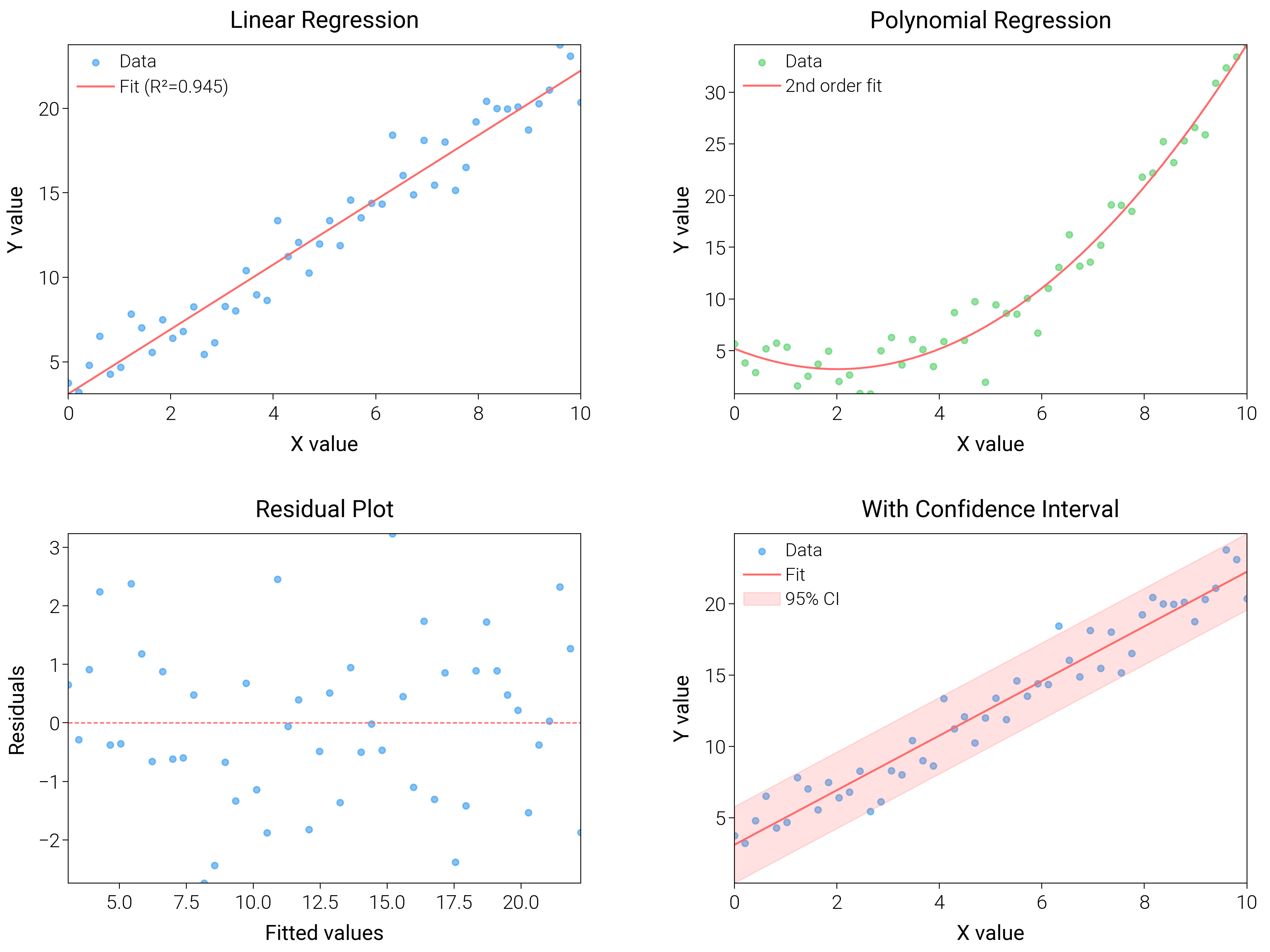
Regression Analysis
Visualize linear and polynomial fits plus confidence bands to make model quality and spread visible.
import matplotlib.pyplot as plt
import numpy as np
from scipy import stats

import dartwork_mpl as dm

# Apply scientific style preset
dm.style.use("scientific")

# Generate data
np.random.seed(42)
x = np.linspace(0, 10, 50)
y_linear = 2 * x + 3 + np.random.normal(0, 1.5, len(x))
y_poly = 0.5 * x**2 - 2 * x + 5 + np.random.normal(0, 2, len(x))

# Create figure
# Double column figure: 17cm width, 2x2 layout
fig = plt.figure(figsize=(dm.cm2in(16), dm.cm2in(12)), dpi=300)

# Create GridSpec for 2x2 subplots
gs = fig.add_gridspec(
    nrows=2,
    ncols=2,
    left=0.08,
    right=0.98,
    top=0.95,
    bottom=0.08,
    wspace=0.3,
    hspace=0.4,
)

# Panel A: Linear regression
ax1 = fig.add_subplot(gs[0, 0])
slope, intercept, r_value, p_value, std_err = stats.linregress(x, y_linear)
y_fit = slope * x + intercept
ax1.scatter(x, y_linear, c="oc.blue5", s=5, alpha=0.6, label="Data")
ax1.plot(x, y_fit, color="oc.red5", lw=0.7, label=f"Fit (R²={r_value**2:.3f})")
ax1.set_xlabel("X value", fontsize=dm.fs(0))
ax1.set_ylabel("Y value", fontsize=dm.fs(0))
ax1.set_title("Linear Regression", fontsize=dm.fs(1))
ax1.legend(loc="best", fontsize=dm.fs(-1))
ax1.set_xticks([0, 2, 4, 6, 8, 10])

# Panel B: Polynomial regression
ax2 = fig.add_subplot(gs[0, 1])
coeffs = np.polyfit(x, y_poly, 2)
y_poly_fit = np.polyval(coeffs, x)
ax2.scatter(x, y_poly, c="oc.green5", s=5, alpha=0.6, label="Data")
ax2.plot(x, y_poly_fit, color="oc.red5", lw=0.7, label="2nd order fit")
ax2.set_xlabel("X value", fontsize=dm.fs(0))
ax2.set_ylabel("Y value", fontsize=dm.fs(0))
ax2.set_title("Polynomial Regression", fontsize=dm.fs(1))
ax2.legend(loc="best", fontsize=dm.fs(-1))
ax2.set_xticks([0, 2, 4, 6, 8, 10])

# Panel C: Residuals plot
ax3 = fig.add_subplot(gs[1, 0])
residuals = y_linear - y_fit
ax3.scatter(y_fit, residuals, c="oc.blue5", s=5, alpha=0.6)
ax3.axhline(y=0, color="oc.red5", lw=0.5, linestyle="--")
ax3.set_xlabel("Fitted values", fontsize=dm.fs(0))
ax3.set_ylabel("Residuals", fontsize=dm.fs(0))
ax3.set_title("Residual Plot", fontsize=dm.fs(1))

# Panel D: With confidence interval
ax4 = fig.add_subplot(gs[1, 1])
# Calculate prediction interval
predict_err = np.sqrt(std_err**2 + np.var(y_linear - y_fit))
y_upper = y_fit + 1.96 * predict_err
y_lower = y_fit - 1.96 * predict_err
ax4.scatter(x, y_linear, c="oc.blue5", s=5, alpha=0.6, label="Data")
ax4.plot(x, y_fit, color="oc.red5", lw=0.7, label="Fit")
ax4.fill_between(
    x, y_lower, y_upper, color="oc.red5", alpha=0.2, label="95% CI"
)
ax4.set_xlabel("X value", fontsize=dm.fs(0))
ax4.set_ylabel("Y value", fontsize=dm.fs(0))
ax4.set_title("With Confidence Interval", fontsize=dm.fs(1))
ax4.legend(loc="best", fontsize=dm.fs(-1))
ax4.set_xticks([0, 2, 4, 6, 8, 10])

# Optimize layout
dm.simple_layout(fig, gs=gs)

# Save and show plot
plt.show()
Total running time of the script: (0 minutes 2.994 seconds)