Note
Go to the end to download the full example code.
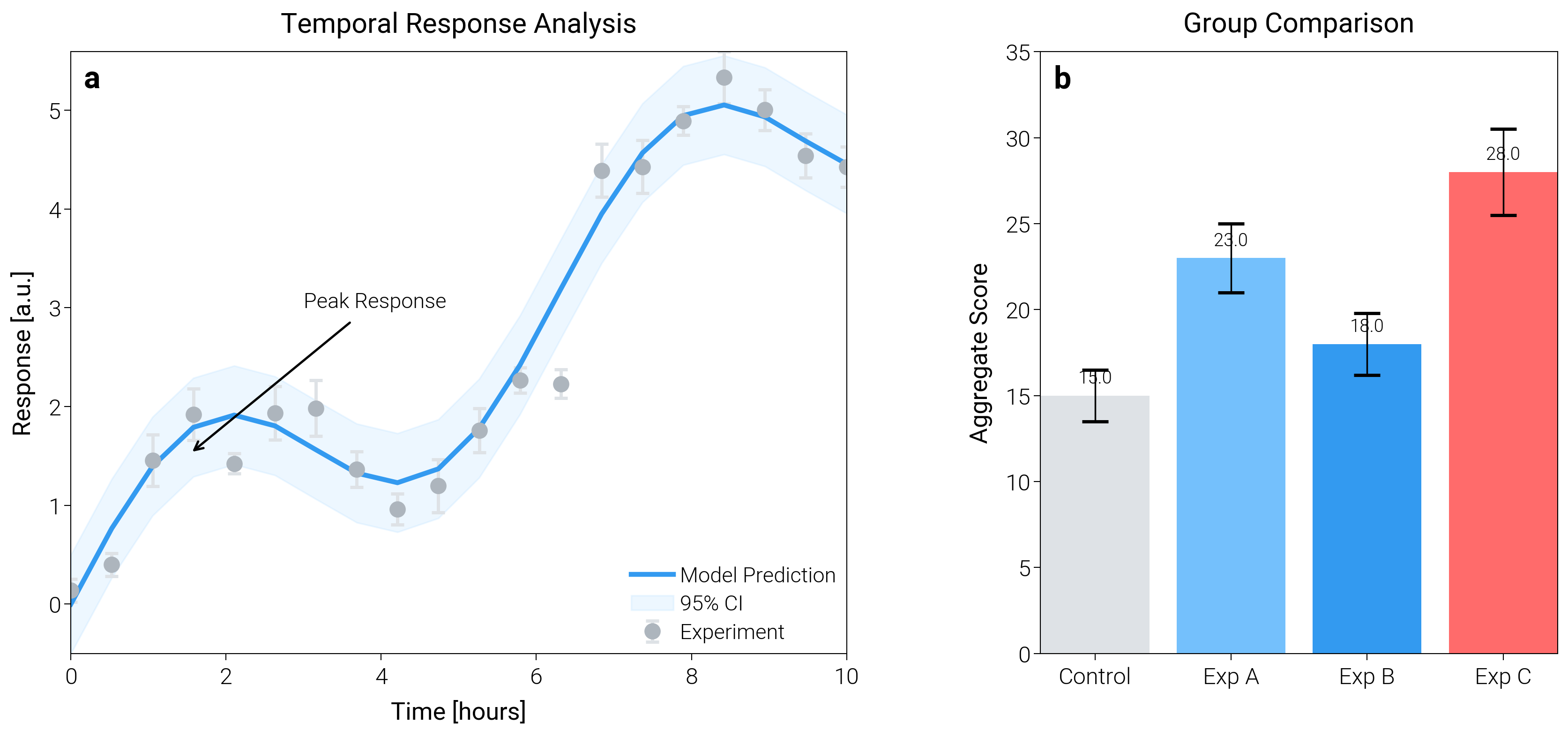
Scientific Paper Figure
Use a full scientific figure template with multi-panels, shared colorbars, inset annotations, and consistent typography.
import matplotlib.pyplot as plt
import numpy as np

import dartwork_mpl as dm

# Apply scientific style
dm.style.use("scientific")

# Generate synthetic data
x = np.linspace(0, 10, 20)
y_model = 0.5 * x + np.sin(x)
y_data = y_model + np.random.normal(0, 0.3, size=len(x))
y_error = np.random.uniform(0.1, 0.3, size=len(x))

categories = ["Control", "Exp A", "Exp B", "Exp C"]
values = [15, 23, 18, 28]
errors = [1.5, 2.0, 1.8, 2.5]

# Create figure (Double column width for papers: ~17cm)
fig = plt.figure(figsize=(dm.cm2in(17), dm.cm2in(8)), dpi=300)
gs = fig.add_gridspec(
    1,
    2,
    width_ratios=[1.5, 1],
    left=0.08,
    right=0.98,
    top=0.95,
    bottom=0.12,
    wspace=0.3,
)

# Panel A: Regression with Error Bars
ax1 = fig.add_subplot(gs[0])
ax1.errorbar(
    x,
    y_data,
    yerr=y_error,
    fmt="o",
    color="oc.gray5",
    ecolor="oc.gray3",
    elinewidth=1,
    capsize=2,
    markersize=4,
    label="Experiment",
)
ax1.plot(x, y_model, color="oc.blue5", lw=1.5, label="Model Prediction")
ax1.fill_between(
    x, y_model - 0.5, y_model + 0.5, color="oc.blue2", alpha=0.2, label="95% CI"
)

ax1.set_xlabel("Time [hours]", fontsize=dm.fs(0))
ax1.set_ylabel("Response [a.u.]", fontsize=dm.fs(0))
ax1.set_title("Temporal Response Analysis", fontsize=dm.fs(1))
ax1.legend(loc="best", fontsize=dm.fs(-1), ncol=1)

# Annotation
ax1.annotate(
    "Peak Response",
    xy=(1.5, 1.5),
    xytext=(3, 3),
    arrowprops={"arrowstyle": "->", "color": "black", "lw": 0.7},
    fontsize=dm.fs(-1),
)

# Panel B: Bar Chart Comparison
ax2 = fig.add_subplot(gs[1])
bars = ax2.bar(
    categories,
    values,
    yerr=errors,
    capsize=4,
    color=["oc.gray3", "oc.blue3", "oc.blue5", "oc.red5"],
    edgecolor="none",
)

ax2.set_ylabel("Aggregate Score", fontsize=dm.fs(0))
ax2.set_title("Group Comparison", fontsize=dm.fs(1))
ax2.set_ylim(0, 35)

# Add value labels on bars
for bar in bars:
    height = bar.get_height()
    ax2.text(
        bar.get_x() + bar.get_width() / 2.0,
        height + 0.5,
        f"{height:.1f}",
        ha="center",
        va="bottom",
        fontsize=dm.fs(-2),
    )

# Add subplot labels
for ax, label in zip([ax1, ax2], "ab", strict=False):
    offset = dm.make_offset(4, -4, fig)
    ax.text(
        0,
        1,
        label,
        transform=ax.transAxes + offset,
        weight="bold",
        va="top",
        fontsize=dm.fs(2),
    )

# Optimize layout
dm.simple_layout(fig, gs=gs)

plt.show()
Total running time of the script: (0 minutes 1.307 seconds)