Note
Go to the end to download the full example code.
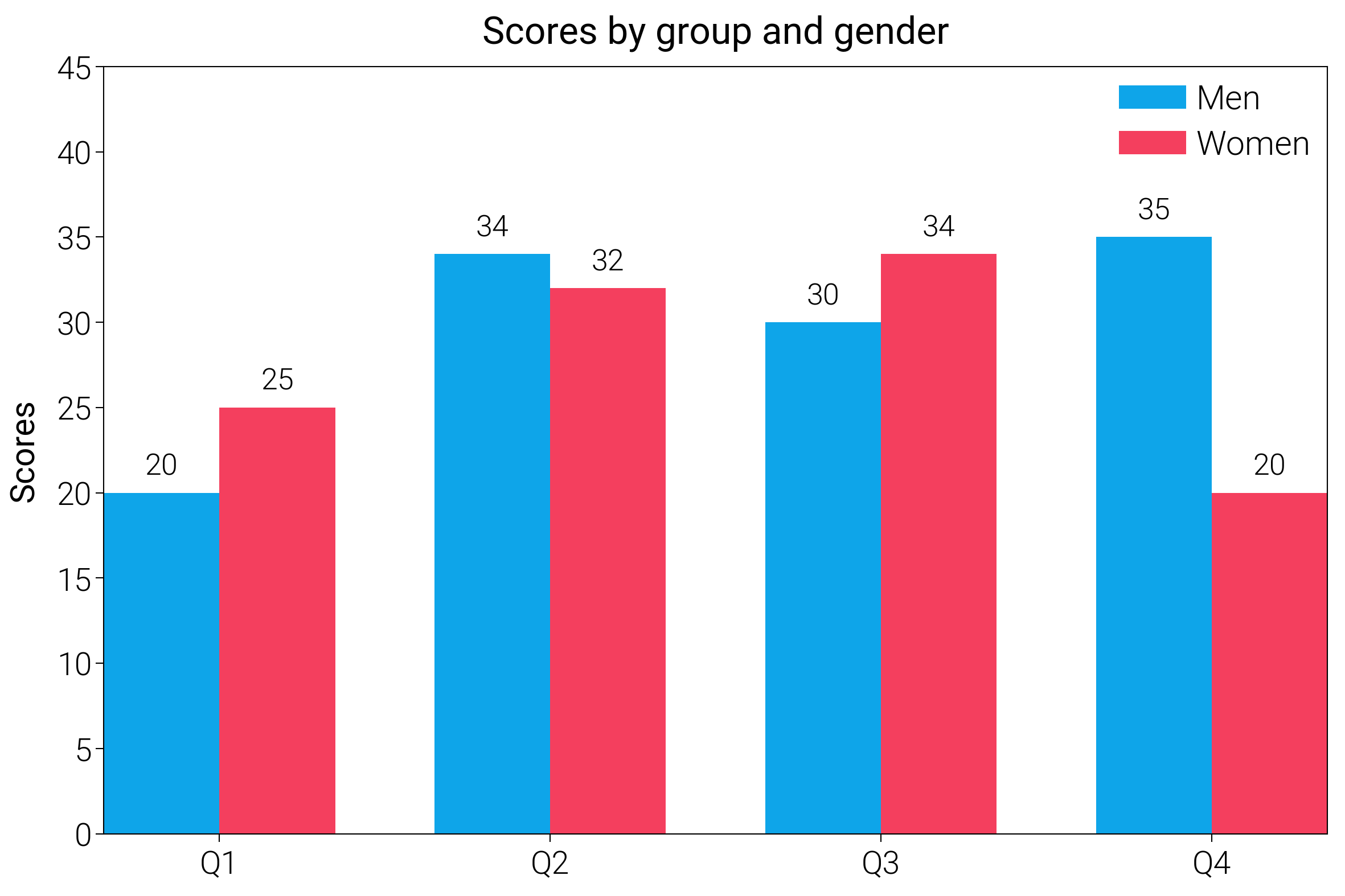
Bar Charts
Start from basic, grouped, and labeled bars with gentle spacing so categories stay readable.
import matplotlib.pyplot as plt
import numpy as np

import dartwork_mpl as dm

# Apply presentation style for bolder look
dm.style.use("presentation")

# Data
labels = ["Q1", "Q2", "Q3", "Q4"]
men_means = [20, 34, 30, 35]
women_means = [25, 32, 34, 20]

x = np.arange(len(labels))
width = 0.35

fig = plt.figure(figsize=(dm.cm2in(12), dm.cm2in(8)), dpi=300)
gs = fig.add_gridspec(1, 1, left=0.12, right=0.95, top=0.92, bottom=0.12)
ax = fig.add_subplot(gs[0, 0])

# Plotting with Tailwind colors
rects1 = ax.bar(x - width / 2, men_means, width, label="Men", color="tw.sky500")
rects2 = ax.bar(
    x + width / 2, women_means, width, label="Women", color="tw.rose500"
)

# Add some text for labels, title and custom x-axis tick labels, etc.
ax.set_ylabel("Scores", fontsize=dm.fs(0))
ax.set_title("Scores by group and gender", fontsize=dm.fs(1))
ax.set_xticks(x)
ax.set_xticklabels(labels)
ax.legend(loc="best", fontsize=dm.fs(0), ncol=1)

# Add value labels
ax.bar_label(rects1, padding=3, fontsize=dm.fs(-1))
ax.bar_label(rects2, padding=3, fontsize=dm.fs(-1))

ax.set_ylim(0, 45)

dm.simple_layout(fig, gs=gs)

plt.show()
Total running time of the script: (0 minutes 0.833 seconds)