Note
Go to the end to download the full example code.
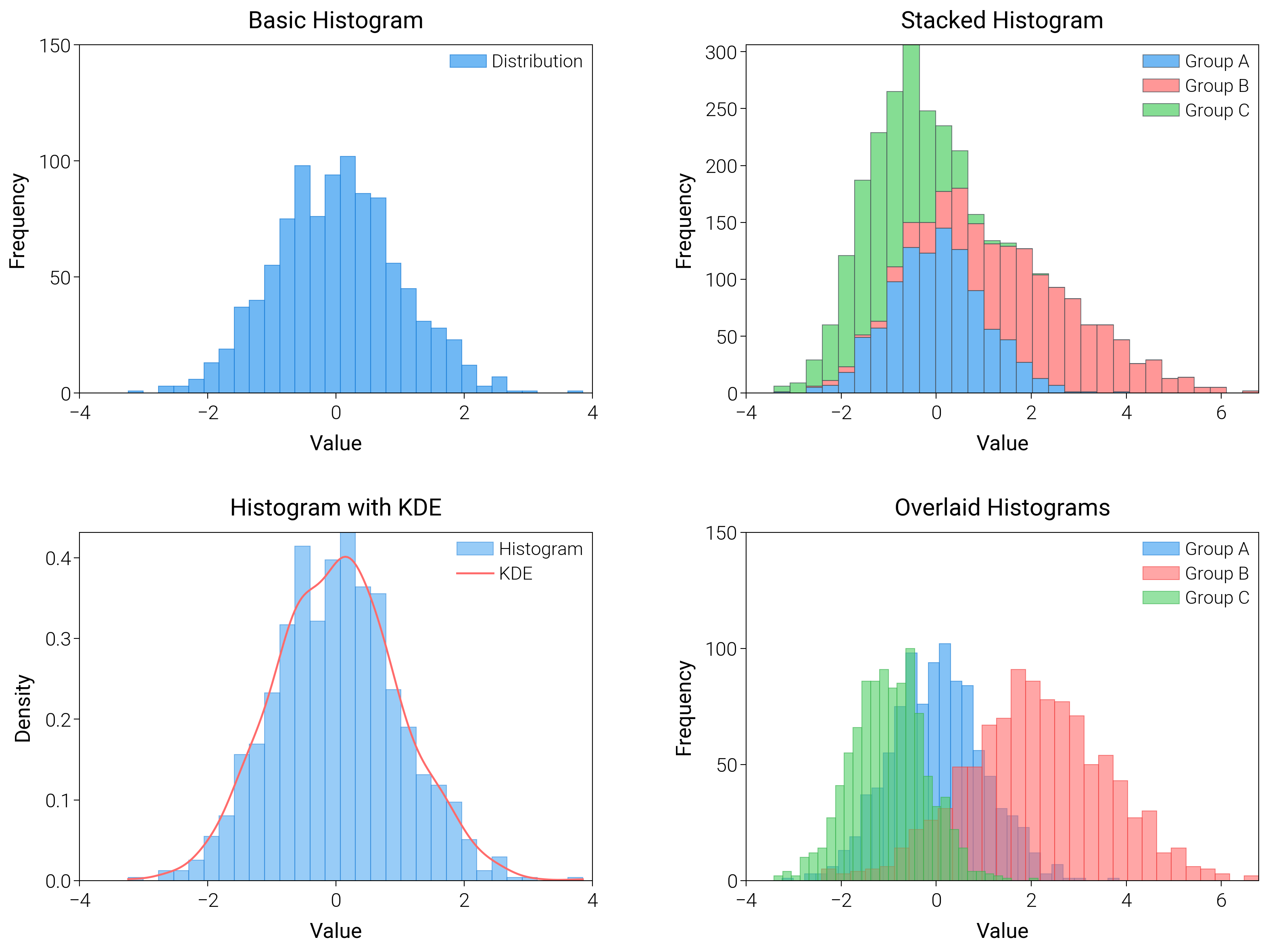
Histograms
Compare binning choices and overlays (density curves, step histograms) to pick a truthful view of your data.
import matplotlib.pyplot as plt
import numpy as np
from scipy import stats

import dartwork_mpl as dm

# Apply scientific style preset
# Default: font.size=7.5, lines.linewidth=0.5, axes.linewidth=0.3
dm.style.use("scientific")

# Generate sample data
np.random.seed(42)
data1 = np.random.normal(0, 1, 1000)
data2 = np.random.normal(2, 1.5, 1000)
data3 = np.random.normal(-1, 0.8, 1000)

# Create figure
# Double column figure: 17cm width, 2x2 layout
fig = plt.figure(figsize=(dm.cm2in(16), dm.cm2in(12)), dpi=300)

# Create GridSpec for 2x2 subplots
gs = fig.add_gridspec(
    nrows=2,
    ncols=2,
    left=0.08,
    right=0.98,
    top=0.95,
    bottom=0.08,
    wspace=0.3,
    hspace=0.4,
)

# Panel A: Basic histogram
ax1 = fig.add_subplot(gs[0, 0])
# Explicit parameters: bins=30, alpha=0.7, edgecolor, linewidth=0.3
n1, bins1, patches1 = ax1.hist(
    data1,
    bins=30,
    color="oc.blue5",
    alpha=0.7,
    edgecolor="oc.blue7",
    linewidth=0.3,
    label="Distribution",
)
ax1.set_xlabel("Value", fontsize=dm.fs(0))
ax1.set_ylabel("Frequency", fontsize=dm.fs(0))
ax1.set_title("Basic Histogram", fontsize=dm.fs(1))
ax1.legend(loc="best", fontsize=dm.fs(-1), ncol=1)
# Set explicit ticks
ax1.set_xticks([-4, -2, 0, 2, 4])
ax1.set_yticks([0, 50, 100, 150])

# Panel B: Stacked histogram
ax2 = fig.add_subplot(gs[0, 1])
# Explicit parameters: bins=30, alpha=0.7 for each
n2, bins2, patches2 = ax2.hist(
    [data1, data2, data3],
    bins=30,
    color=["oc.blue5", "oc.red5", "oc.green5"],
    alpha=0.7,
    edgecolor="oc.gray7",
    linewidth=0.3,
    label=["Group A", "Group B", "Group C"],
    stacked=True,
)
ax2.set_xlabel("Value", fontsize=dm.fs(0))
ax2.set_ylabel("Frequency", fontsize=dm.fs(0))
ax2.set_title("Stacked Histogram", fontsize=dm.fs(1))
ax2.legend(loc="best", fontsize=dm.fs(-1), ncol=1)
# Set explicit ticks
ax2.set_xticks([-4, -2, 0, 2, 4, 6])

# Panel C: Histogram with KDE overlay
ax3 = fig.add_subplot(gs[1, 0])
# Histogram: bins=30, alpha=0.5
n3, bins3, patches3 = ax3.hist(
    data1,
    bins=30,
    color="oc.blue5",
    alpha=0.5,
    edgecolor="oc.blue7",
    linewidth=0.3,
    density=True,
    label="Histogram",
)
# KDE overlay
x_kde = np.linspace(data1.min(), data1.max(), 200)
kde = stats.gaussian_kde(data1)
y_kde = kde(x_kde)
# KDE line: lw=0.7
ax3.plot(x_kde, y_kde, color="oc.red5", lw=0.7, label="KDE")
ax3.set_xlabel("Value", fontsize=dm.fs(0))
ax3.set_ylabel("Density", fontsize=dm.fs(0))
ax3.set_title("Histogram with KDE", fontsize=dm.fs(1))
ax3.legend(loc="best", fontsize=dm.fs(-1), ncol=1)
# Set explicit ticks
ax3.set_xticks([-4, -2, 0, 2, 4])
ax3.set_yticks([0, 0.1, 0.2, 0.3, 0.4])

# Panel D: Overlaid histograms
ax4 = fig.add_subplot(gs[1, 1])
# Explicit parameters: bins=30, alpha=0.6 for transparency
n4a, bins4a, patches4a = ax4.hist(
    data1,
    bins=30,
    color="oc.blue5",
    alpha=0.6,
    edgecolor="oc.blue7",
    linewidth=0.3,
    label="Group A",
)
n4b, bins4b, patches4b = ax4.hist(
    data2,
    bins=30,
    color="oc.red5",
    alpha=0.6,
    edgecolor="oc.red7",
    linewidth=0.3,
    label="Group B",
)
n4c, bins4c, patches4c = ax4.hist(
    data3,
    bins=30,
    color="oc.green5",
    alpha=0.6,
    edgecolor="oc.green7",
    linewidth=0.3,
    label="Group C",
)
ax4.set_xlabel("Value", fontsize=dm.fs(0))
ax4.set_ylabel("Frequency", fontsize=dm.fs(0))
ax4.set_title("Overlaid Histograms", fontsize=dm.fs(1))
ax4.legend(loc="best", fontsize=dm.fs(-1), ncol=1)
# Set explicit ticks
ax4.set_xticks([-4, -2, 0, 2, 4, 6])
ax4.set_yticks([0, 50, 100, 150])

# Optimize layout
dm.simple_layout(fig, gs=gs)

# Save and show plot
plt.show()
Total running time of the script: (0 minutes 2.506 seconds)