Note
Go to the end to download the full example code.
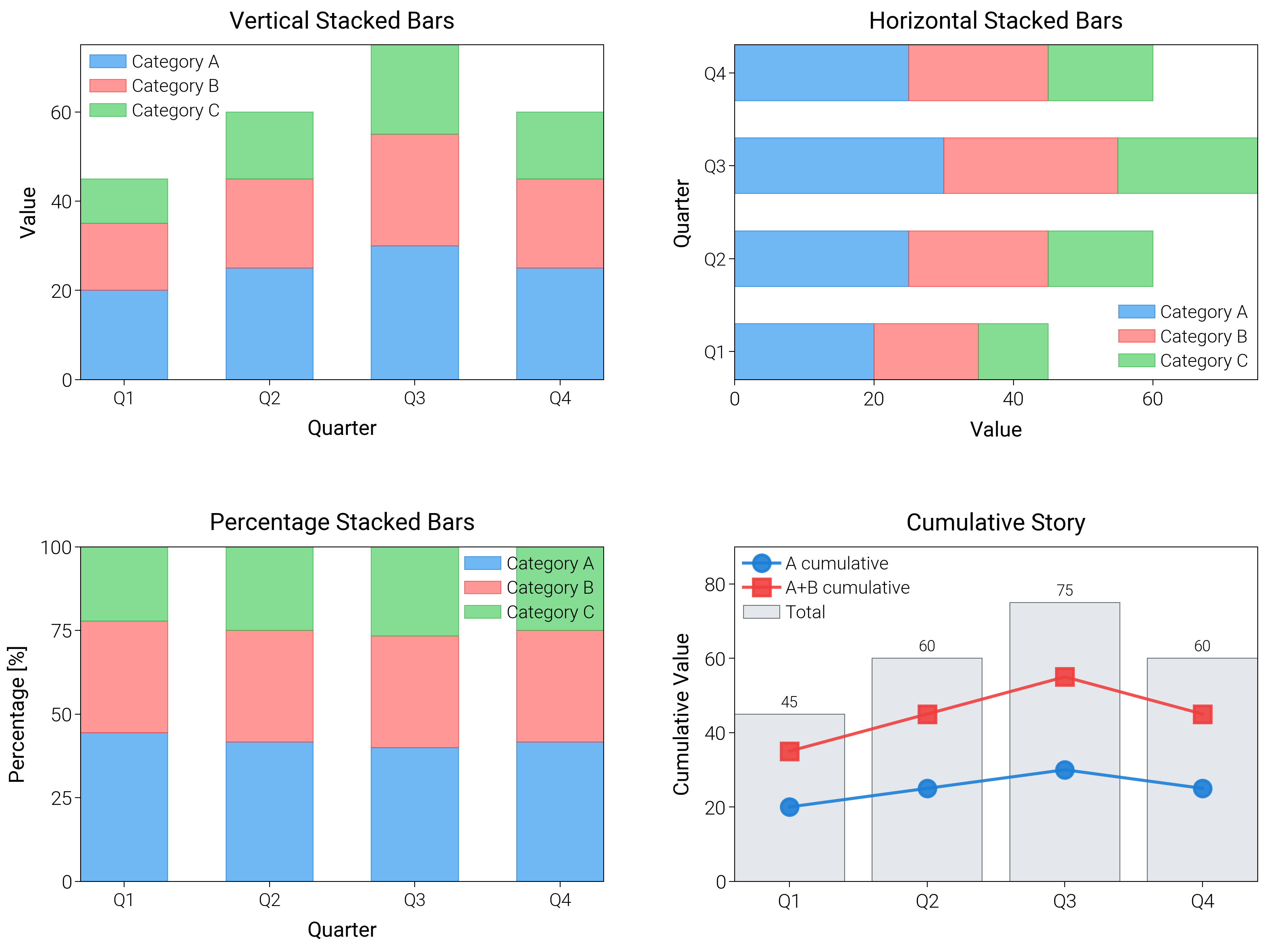
Stacked Bar Chart
Stack categories vertically or horizontally, switch to 100% shares, and add cumulative views to tell composition stories.
import matplotlib.pyplot as plt
import numpy as np

import dartwork_mpl as dm

# Apply scientific style preset
# Default: font.size=7.5, lines.linewidth=0.5, axes.linewidth=0.3
dm.style.use("scientific")

# Sample data
categories = ["Q1", "Q2", "Q3", "Q4"]
values1 = np.array([20, 25, 30, 25])
values2 = np.array([15, 20, 25, 20])
values3 = np.array([10, 15, 20, 15])

# Percentage data
total = values1 + values2 + values3
pct1 = values1 / total * 100
pct2 = values2 / total * 100
pct3 = values3 / total * 100

# Create figure (square-ish): 16 cm wide, 12 cm tall
fig = plt.figure(figsize=(dm.cm2in(16), dm.cm2in(12)), dpi=300)

# Create GridSpec for 4 subplots (2x2)
gs = fig.add_gridspec(
    nrows=2,
    ncols=2,
    left=0.08,
    right=0.98,
    top=0.92,
    bottom=0.12,
    wspace=0.25,
    hspace=0.5,
)

# Panel A: Vertical stacked bars
ax1 = fig.add_subplot(gs[0, 0])
x_pos = np.arange(len(categories))
width = 0.6
# Explicit parameters: width=0.6, alpha=0.7, edgecolor, linewidth=0.3
bars1a = ax1.bar(
    x_pos,
    values1,
    width,
    color="oc.blue5",
    alpha=0.7,
    edgecolor="oc.blue7",
    linewidth=0.3,
    label="Category A",
)
bars1b = ax1.bar(
    x_pos,
    values2,
    width,
    bottom=values1,
    color="oc.red5",
    alpha=0.7,
    edgecolor="oc.red7",
    linewidth=0.3,
    label="Category B",
)
bars1c = ax1.bar(
    x_pos,
    values3,
    width,
    bottom=values1 + values2,
    color="oc.green5",
    alpha=0.7,
    edgecolor="oc.green7",
    linewidth=0.3,
    label="Category C",
)
ax1.set_xlabel("Quarter", fontsize=dm.fs(0))
ax1.set_ylabel("Value", fontsize=dm.fs(0))
ax1.set_title("Vertical Stacked Bars", fontsize=dm.fs(1))
ax1.set_xticks(x_pos)
ax1.set_xticklabels(categories, fontsize=dm.fs(-1))
ax1.legend(loc="best", fontsize=dm.fs(-1), ncol=1)
ax1.set_yticks([0, 20, 40, 60])

# Panel B: Horizontal stacked bars
ax2 = fig.add_subplot(gs[0, 1])
y_pos = np.arange(len(categories))
height = 0.6
# Explicit parameters: height=0.6, alpha=0.7
bars2a = ax2.barh(
    y_pos,
    values1,
    height,
    color="oc.blue5",
    alpha=0.7,
    edgecolor="oc.blue7",
    linewidth=0.3,
    label="Category A",
)
bars2b = ax2.barh(
    y_pos,
    values2,
    height,
    left=values1,
    color="oc.red5",
    alpha=0.7,
    edgecolor="oc.red7",
    linewidth=0.3,
    label="Category B",
)
bars2c = ax2.barh(
    y_pos,
    values3,
    height,
    left=values1 + values2,
    color="oc.green5",
    alpha=0.7,
    edgecolor="oc.green7",
    linewidth=0.3,
    label="Category C",
)
ax2.set_xlabel("Value", fontsize=dm.fs(0))
ax2.set_ylabel("Quarter", fontsize=dm.fs(0))
ax2.set_title("Horizontal Stacked Bars", fontsize=dm.fs(1))
ax2.set_yticks(y_pos)
ax2.set_yticklabels(categories, fontsize=dm.fs(-1))
ax2.legend(loc="best", fontsize=dm.fs(-1), ncol=1)
ax2.set_xticks([0, 20, 40, 60])

# Panel C: Percentage stacked bars
ax3 = fig.add_subplot(gs[1, 0])
# Explicit parameters: width=0.6, alpha=0.7
bars3a = ax3.bar(
    x_pos,
    pct1,
    width,
    color="oc.blue5",
    alpha=0.7,
    edgecolor="oc.blue7",
    linewidth=0.3,
    label="Category A",
)
bars3b = ax3.bar(
    x_pos,
    pct2,
    width,
    bottom=pct1,
    color="oc.red5",
    alpha=0.7,
    edgecolor="oc.red7",
    linewidth=0.3,
    label="Category B",
)
bars3c = ax3.bar(
    x_pos,
    pct3,
    width,
    bottom=pct1 + pct2,
    color="oc.green5",
    alpha=0.7,
    edgecolor="oc.green7",
    linewidth=0.3,
    label="Category C",
)
ax3.set_xlabel("Quarter", fontsize=dm.fs(0))
ax3.set_ylabel("Percentage [%]", fontsize=dm.fs(0))
ax3.set_title("Percentage Stacked Bars", fontsize=dm.fs(1))
ax3.set_xticks(x_pos)
ax3.set_xticklabels(categories, fontsize=dm.fs(-1))
ax3.legend(loc="best", fontsize=dm.fs(-1), ncol=1)
ax3.set_yticks([0, 25, 50, 75, 100])
ax3.set_ylim(0, 100)

# Panel D: Cumulative totals with annotations
ax4 = fig.add_subplot(gs[1, 1])
cumulative = np.cumsum(np.vstack([values1, values2, values3]), axis=0)
total_values = cumulative[-1]
bars4 = ax4.bar(
    categories,
    total_values,
    color="oc.gray3",
    alpha=0.8,
    edgecolor="oc.gray7",
    linewidth=0.3,
    label="Total",
)
ax4.plot(
    categories,
    cumulative[0],
    color="oc.blue7",
    lw=1.1,
    marker="o",
    label="A cumulative",
    alpha=0.9,
)
ax4.plot(
    categories,
    cumulative[1],
    color="oc.red7",
    lw=1.1,
    marker="s",
    label="A+B cumulative",
    alpha=0.9,
)
ax4.set_ylabel("Cumulative Value", fontsize=dm.fs(0))
ax4.set_title("Cumulative Story", fontsize=dm.fs(1))
for bar in bars4:
    height = bar.get_height()
    ax4.text(
        bar.get_x() + bar.get_width() / 2,
        height + 1,
        f"{height:.0f}",
        ha="center",
        va="bottom",
        fontsize=dm.fs(-2),
    )
ax4.set_ylim(0, max(total_values) * 1.2)
ax4.legend(fontsize=dm.fs(-1), loc="best")

# Optimize layout
dm.simple_layout(fig, gs=gs)

# Show plot
plt.show()
Total running time of the script: (0 minutes 1.822 seconds)