Note
Go to the end to download the full example code.
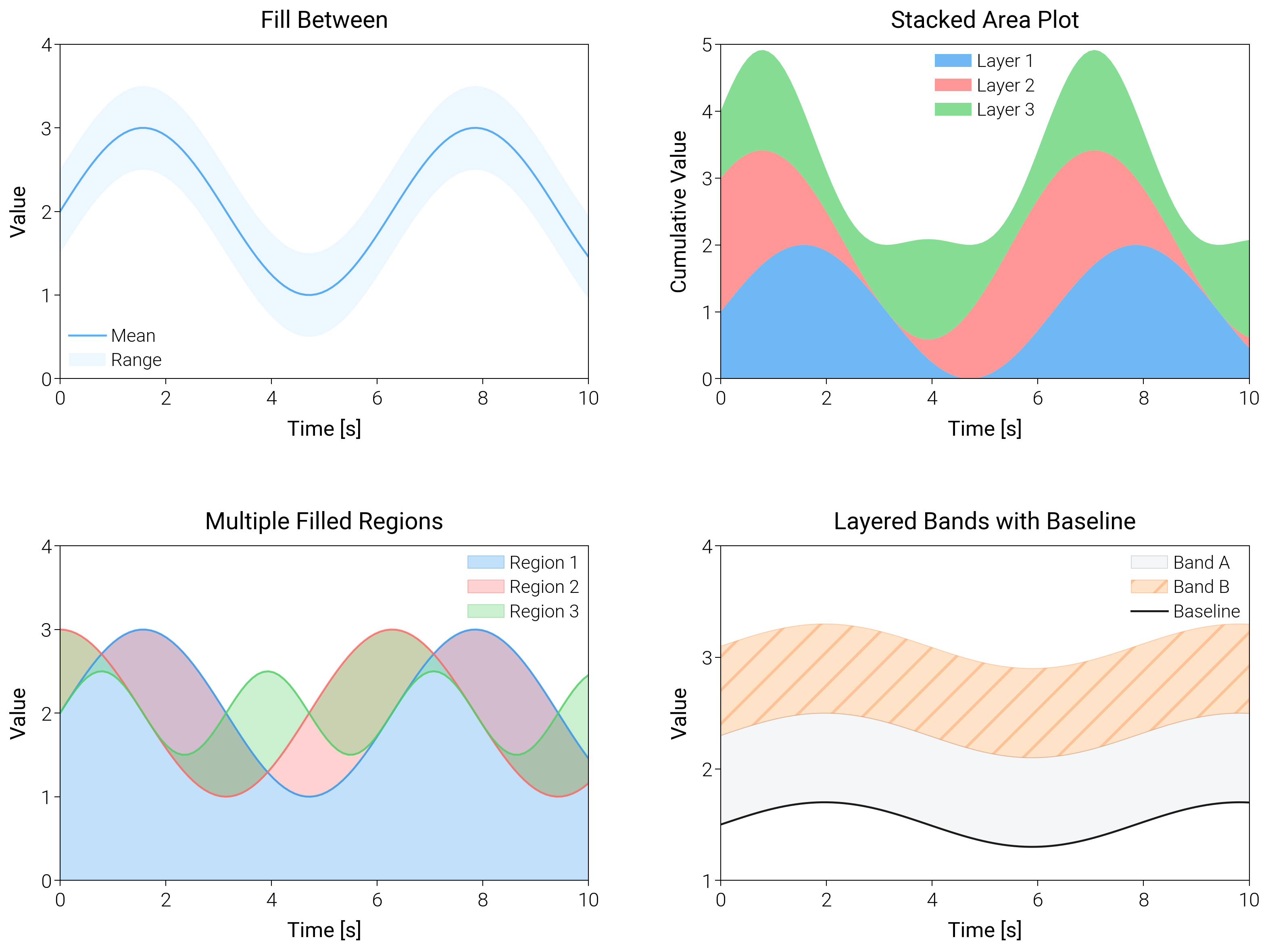
Filled Plots
Layer confidence bands, stacked areas, and smooth fills to emphasize ranges instead of lines.
import matplotlib.pyplot as plt
import numpy as np

import dartwork_mpl as dm

# Apply scientific style preset
# Default: font.size=7.5, lines.linewidth=0.5, axes.linewidth=0.3
dm.style.use("scientific")

# Generate sample data
x = np.linspace(0, 10, 100)
y1 = np.sin(x) + 2
y2 = np.cos(x) + 2
y3 = 0.5 * np.sin(2 * x) + 2

# Upper and lower bounds for fill_between
y_upper = y1 + 0.5
y_lower = y1 - 0.5

# Stacked area data
y_stack1 = np.sin(x) + 1
y_stack2 = np.cos(x) + 1
y_stack3 = 0.5 * np.sin(2 * x) + 1

# Create figure (square-ish): 16 cm wide, 12 cm tall
fig = plt.figure(figsize=(dm.cm2in(16), dm.cm2in(12)), dpi=300)

# Create GridSpec for 4 subplots (2x2)
gs = fig.add_gridspec(
    nrows=2,
    ncols=2,
    left=0.08,
    right=0.98,
    top=0.92,
    bottom=0.12,
    wspace=0.25,
    hspace=0.5,
)

# Panel A: fill_between
ax1 = fig.add_subplot(gs[0, 0])
# Main line: lw=0.7
ax1.plot(x, y1, color="oc.blue5", lw=0.7, label="Mean", alpha=0.8)
# Fill between: alpha=0.2, edgecolors='none'
ax1.fill_between(
    x,
    y_lower,
    y_upper,
    color="oc.blue2",
    alpha=0.2,
    edgecolors="none",
    label="Range",
)
ax1.set_xlabel("Time [s]", fontsize=dm.fs(0))
ax1.set_ylabel("Value", fontsize=dm.fs(0))
ax1.set_title("Fill Between", fontsize=dm.fs(1))
ax1.legend(loc="best", fontsize=dm.fs(-1), ncol=1)
# Set explicit ticks
ax1.set_xticks([0, 2, 4, 6, 8, 10])
ax1.set_yticks([0, 1, 2, 3, 4])

# Panel B: Stacked area plot
ax2 = fig.add_subplot(gs[0, 1])
# Stacked areas: alpha=0.7 for each, edgecolors='none'
ax2.fill_between(
    x,
    0,
    y_stack1,
    color="oc.blue5",
    alpha=0.7,
    edgecolors="none",
    label="Layer 1",
)
ax2.fill_between(
    x,
    y_stack1,
    y_stack1 + y_stack2,
    color="oc.red5",
    alpha=0.7,
    edgecolors="none",
    label="Layer 2",
)
ax2.fill_between(
    x,
    y_stack1 + y_stack2,
    y_stack1 + y_stack2 + y_stack3,
    color="oc.green5",
    alpha=0.7,
    edgecolors="none",
    label="Layer 3",
)
ax2.set_xlabel("Time [s]", fontsize=dm.fs(0))
ax2.set_ylabel("Cumulative Value", fontsize=dm.fs(0))
ax2.set_title("Stacked Area Plot", fontsize=dm.fs(1))
ax2.legend(loc="best", fontsize=dm.fs(-1), ncol=1)
# Set explicit ticks
ax2.set_xticks([0, 2, 4, 6, 8, 10])
ax2.set_yticks([0, 1, 2, 3, 4, 5])

# Panel C: Multiple filled regions
ax3 = fig.add_subplot(gs[1, 0])
# Multiple fills: alpha=0.3 for each
ax3.fill_between(
    x,
    0,
    y1,
    color="oc.blue5",
    alpha=0.3,
    edgecolors="oc.blue7",
    linewidth=0.3,
    label="Region 1",
)
ax3.fill_between(
    x,
    y1,
    y2,
    color="oc.red5",
    alpha=0.3,
    edgecolors="oc.red7",
    linewidth=0.3,
    label="Region 2",
)
ax3.fill_between(
    x,
    y2,
    y3,
    color="oc.green5",
    alpha=0.3,
    edgecolors="oc.green7",
    linewidth=0.3,
    label="Region 3",
)
# Overlay lines: lw=0.7
ax3.plot(x, y1, color="oc.blue5", lw=0.7, alpha=0.8)
ax3.plot(x, y2, color="oc.red5", lw=0.7, alpha=0.8)
ax3.plot(x, y3, color="oc.green5", lw=0.7, alpha=0.8)
ax3.set_xlabel("Time [s]", fontsize=dm.fs(0))
ax3.set_ylabel("Value", fontsize=dm.fs(0))
ax3.set_title("Multiple Filled Regions", fontsize=dm.fs(1))
ax3.legend(loc="best", fontsize=dm.fs(-1), ncol=1)
# Set explicit ticks
ax3.set_xticks([0, 2, 4, 6, 8, 10])
ax3.set_yticks([0, 1, 2, 3, 4])

# Panel D: Baseline comparison with hatching
ax4 = fig.add_subplot(gs[1, 1])
baseline = 1.5 + 0.2 * np.sin(0.8 * x)
ax4.fill_between(
    x,
    baseline,
    baseline + 0.8,
    color="oc.gray3",
    alpha=0.3,
    edgecolors="oc.gray6",
    linewidth=0.3,
    label="Band A",
)
ax4.fill_between(
    x,
    baseline + 0.8,
    baseline + 1.6,
    color="oc.orange5",
    alpha=0.25,
    edgecolors="oc.orange7",
    linewidth=0.3,
    hatch="//",
    label="Band B",
)
ax4.plot(x, baseline, color="0.1", lw=0.7, label="Baseline")
ax4.set_xlabel("Time [s]", fontsize=dm.fs(0))
ax4.set_ylabel("Value", fontsize=dm.fs(0))
ax4.set_title("Layered Bands with Baseline", fontsize=dm.fs(1))
ax4.legend(loc="best", fontsize=dm.fs(-1), ncol=1)
ax4.set_xticks([0, 2, 4, 6, 8, 10])
ax4.set_yticks([1, 2, 3, 4])

# Optimize layout
dm.simple_layout(fig, gs=gs)

# Show plot
plt.show()
Total running time of the script: (0 minutes 1.861 seconds)