Note
Go to the end to download the full example code.
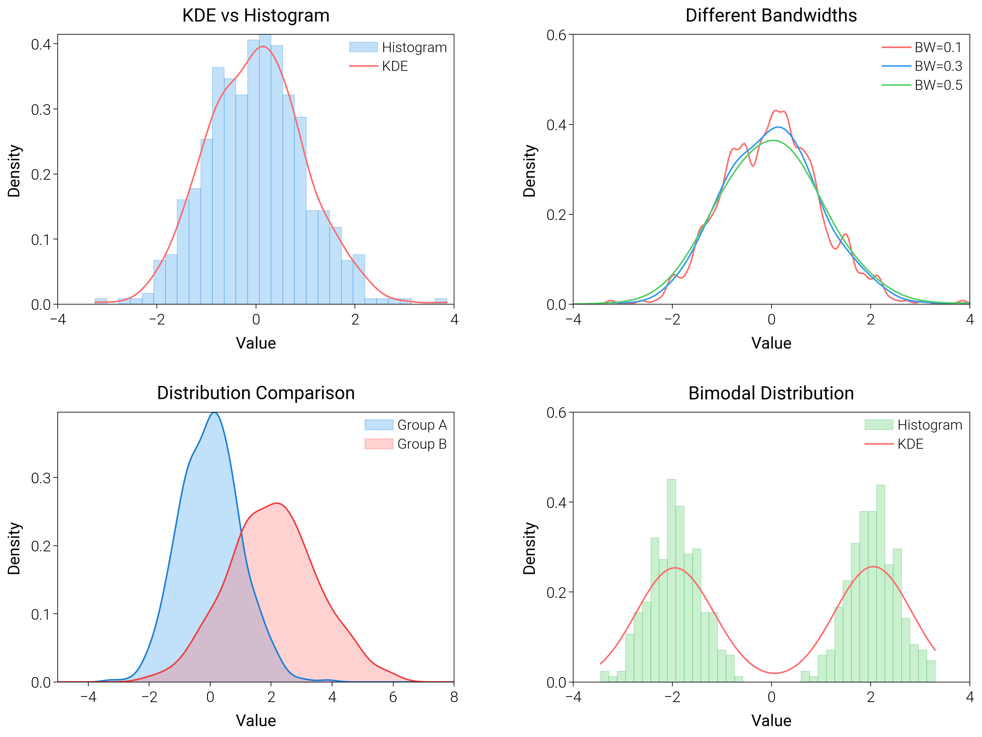
Kernel Density Estimation
Use kernel density estimates for single and grouped data to highlight smooth probability ridges.
import matplotlib.pyplot as plt
import numpy as np
from scipy import stats

import dartwork_mpl as dm

# Apply scientific style preset
dm.style.use("scientific")

# Generate data
np.random.seed(42)
data1 = np.random.normal(0, 1, 500)
data2 = np.random.normal(2, 1.5, 500)
data_bimodal = np.concatenate(
    [np.random.normal(-2, 0.5, 250), np.random.normal(2, 0.5, 250)]
)

# Create figure
# Double column figure: 17cm width, 2x2 layout
fig = plt.figure(figsize=(dm.cm2in(16), dm.cm2in(12)), dpi=300)

# Create GridSpec for 2x2 subplots
gs = fig.add_gridspec(
    nrows=2,
    ncols=2,
    left=0.08,
    right=0.98,
    top=0.95,
    bottom=0.08,
    wspace=0.3,
    hspace=0.4,
)

# Panel A: KDE with histogram
ax1 = fig.add_subplot(gs[0, 0])
ax1.hist(
    data1,
    bins=30,
    density=True,
    color="oc.blue5",
    alpha=0.3,
    edgecolor="oc.blue7",
    linewidth=0.3,
    label="Histogram",
)
kde1 = stats.gaussian_kde(data1)
x_range1 = np.linspace(data1.min(), data1.max(), 200)
ax1.plot(x_range1, kde1(x_range1), color="oc.red5", lw=0.7, label="KDE")
ax1.set_xlabel("Value", fontsize=dm.fs(0))
ax1.set_ylabel("Density", fontsize=dm.fs(0))
ax1.set_title("KDE vs Histogram", fontsize=dm.fs(1))
ax1.legend(loc="best", fontsize=dm.fs(-1))
ax1.set_xticks([-4, -2, 0, 2, 4])
ax1.set_yticks([0, 0.1, 0.2, 0.3, 0.4])

# Panel B: Different bandwidths
ax2 = fig.add_subplot(gs[0, 1])
kde_small = stats.gaussian_kde(data1, bw_method=0.1)
kde_medium = stats.gaussian_kde(data1, bw_method=0.3)
kde_large = stats.gaussian_kde(data1, bw_method=0.5)
x_range = np.linspace(-4, 4, 200)
ax2.plot(x_range, kde_small(x_range), color="oc.red5", lw=0.7, label="BW=0.1")
ax2.plot(x_range, kde_medium(x_range), color="oc.blue5", lw=0.7, label="BW=0.3")
ax2.plot(x_range, kde_large(x_range), color="oc.green5", lw=0.7, label="BW=0.5")
ax2.set_xlabel("Value", fontsize=dm.fs(0))
ax2.set_ylabel("Density", fontsize=dm.fs(0))
ax2.set_title("Different Bandwidths", fontsize=dm.fs(1))
ax2.legend(loc="best", fontsize=dm.fs(-1))
ax2.set_xticks([-4, -2, 0, 2, 4])
ax2.set_yticks([0, 0.2, 0.4, 0.6])

# Panel C: Comparing distributions
ax3 = fig.add_subplot(gs[1, 0])
kde1 = stats.gaussian_kde(data1)
kde2 = stats.gaussian_kde(data2)
x_range_comp = np.linspace(-5, 8, 200)
ax3.fill_between(
    x_range_comp,
    0,
    kde1(x_range_comp),
    color="oc.blue5",
    alpha=0.3,
    label="Group A",
)
ax3.fill_between(
    x_range_comp,
    0,
    kde2(x_range_comp),
    color="oc.red5",
    alpha=0.3,
    label="Group B",
)
ax3.plot(x_range_comp, kde1(x_range_comp), color="oc.blue7", lw=0.7)
ax3.plot(x_range_comp, kde2(x_range_comp), color="oc.red7", lw=0.7)
ax3.set_xlabel("Value", fontsize=dm.fs(0))
ax3.set_ylabel("Density", fontsize=dm.fs(0))
ax3.set_title("Distribution Comparison", fontsize=dm.fs(1))
ax3.legend(loc="best", fontsize=dm.fs(-1))
ax3.set_xticks([-4, -2, 0, 2, 4, 6, 8])
ax3.set_yticks([0, 0.1, 0.2, 0.3])

# Panel D: Bimodal distribution
ax4 = fig.add_subplot(gs[1, 1])
ax4.hist(
    data_bimodal,
    bins=40,
    density=True,
    color="oc.green5",
    alpha=0.3,
    edgecolor="oc.green7",
    linewidth=0.3,
    label="Histogram",
)
kde_bimodal = stats.gaussian_kde(data_bimodal)
x_range_bi = np.linspace(data_bimodal.min(), data_bimodal.max(), 200)
ax4.plot(
    x_range_bi, kde_bimodal(x_range_bi), color="oc.red5", lw=0.7, label="KDE"
)
ax4.set_xlabel("Value", fontsize=dm.fs(0))
ax4.set_ylabel("Density", fontsize=dm.fs(0))
ax4.set_title("Bimodal Distribution", fontsize=dm.fs(1))
ax4.legend(loc="best", fontsize=dm.fs(-1))
ax4.set_xticks([-4, -2, 0, 2, 4])
ax4.set_yticks([0, 0.2, 0.4, 0.6])

# Optimize layout
dm.simple_layout(fig, gs=gs)

# Save and show plot
plt.show()
Total running time of the script: (0 minutes 1.933 seconds)