Note
Go to the end to download the full example code.
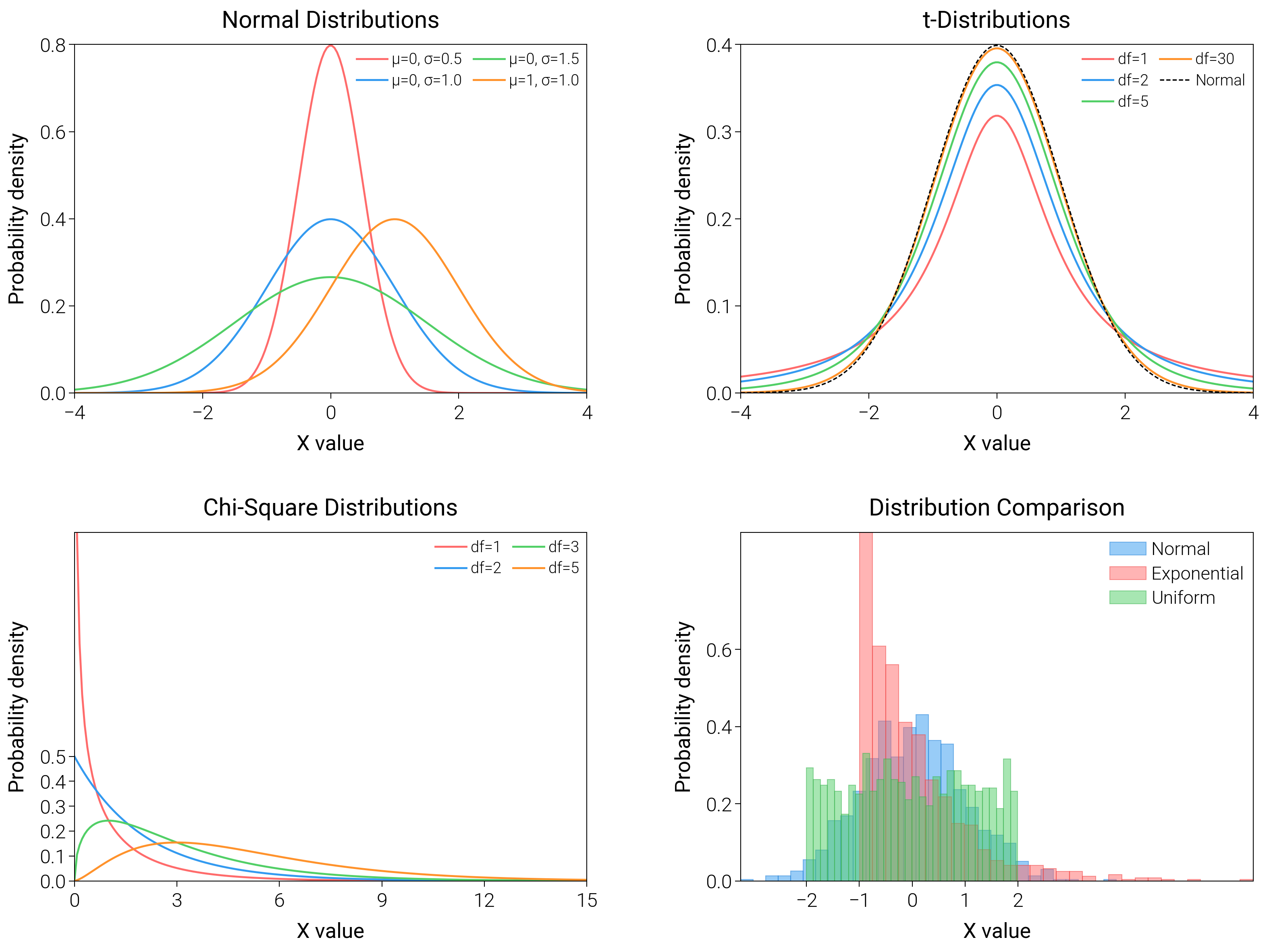
Probability Distributions
Put histograms, ECDFs, and PDFs together so readers see both raw counts and cumulative behavior at a glance.
import matplotlib.pyplot as plt
import numpy as np
from scipy import stats

import dartwork_mpl as dm

# Apply scientific style preset
dm.style.use("scientific")

# Generate data
np.random.seed(42)
x_range = np.linspace(-4, 4, 200)

# Create figure
# Double column figure: 17cm width, 2x2 layout
fig = plt.figure(figsize=(dm.cm2in(16), dm.cm2in(12)), dpi=300)

# Create GridSpec for 2x2 subplots
gs = fig.add_gridspec(
    nrows=2,
    ncols=2,
    left=0.08,
    right=0.98,
    top=0.95,
    bottom=0.08,
    wspace=0.3,
    hspace=0.4,
)

# Panel A: Normal distributions
ax1 = fig.add_subplot(gs[0, 0])
for mu, sigma, color, label in [
    (0, 0.5, "oc.red5", "μ=0, σ=0.5"),
    (0, 1.0, "oc.blue5", "μ=0, σ=1.0"),
    (0, 1.5, "oc.green5", "μ=0, σ=1.5"),
    (1, 1.0, "oc.orange5", "μ=1, σ=1.0"),
]:
    y = stats.norm.pdf(x_range, mu, sigma)
    ax1.plot(x_range, y, color=color, lw=0.7, label=label)
ax1.set_xlabel("X value", fontsize=dm.fs(0))
ax1.set_ylabel("Probability density", fontsize=dm.fs(0))
ax1.set_title("Normal Distributions", fontsize=dm.fs(1))
ax1.legend(loc="best", fontsize=dm.fs(-2), ncol=2)
ax1.set_xticks([-4, -2, 0, 2, 4])
ax1.set_yticks([0, 0.2, 0.4, 0.6, 0.8])

# Panel B: t-distribution
ax2 = fig.add_subplot(gs[0, 1])
for df, color, label in [
    (1, "oc.red5", "df=1"),
    (2, "oc.blue5", "df=2"),
    (5, "oc.green5", "df=5"),
    (30, "oc.orange5", "df=30"),
]:
    y = stats.t.pdf(x_range, df)
    ax2.plot(x_range, y, color=color, lw=0.7, label=label)
y_norm = stats.norm.pdf(x_range)
ax2.plot(x_range, y_norm, "k--", lw=0.5, label="Normal")
ax2.set_xlabel("X value", fontsize=dm.fs(0))
ax2.set_ylabel("Probability density", fontsize=dm.fs(0))
ax2.set_title("t-Distributions", fontsize=dm.fs(1))
ax2.legend(loc="best", fontsize=dm.fs(-2), ncol=2)
ax2.set_xticks([-4, -2, 0, 2, 4])
ax2.set_yticks([0, 0.1, 0.2, 0.3, 0.4])

# Panel C: Chi-square distribution
ax3 = fig.add_subplot(gs[1, 0])
x_chi = np.linspace(0, 15, 200)
for df, color, label in [
    (1, "oc.red5", "df=1"),
    (2, "oc.blue5", "df=2"),
    (3, "oc.green5", "df=3"),
    (5, "oc.orange5", "df=5"),
]:
    y = stats.chi2.pdf(x_chi, df)
    ax3.plot(x_chi, y, color=color, lw=0.7, label=label)
ax3.set_xlabel("X value", fontsize=dm.fs(0))
ax3.set_ylabel("Probability density", fontsize=dm.fs(0))
ax3.set_title("Chi-Square Distributions", fontsize=dm.fs(1))
ax3.legend(loc="best", fontsize=dm.fs(-2), ncol=2)
ax3.set_xticks([0, 3, 6, 9, 12, 15])
ax3.set_yticks([0, 0.1, 0.2, 0.3, 0.4, 0.5])

# Panel D: Comparison of distributions
ax4 = fig.add_subplot(gs[1, 1])
data_normal = np.random.normal(0, 1, 1000)
data_exp = np.random.exponential(1, 1000) - 1
data_uniform = np.random.uniform(-2, 2, 1000)
ax4.hist(
    data_normal,
    bins=30,
    density=True,
    color="oc.blue5",
    alpha=0.5,
    edgecolor="oc.blue7",
    linewidth=0.3,
    label="Normal",
)
ax4.hist(
    data_exp,
    bins=30,
    density=True,
    color="oc.red5",
    alpha=0.5,
    edgecolor="oc.red7",
    linewidth=0.3,
    label="Exponential",
)
ax4.hist(
    data_uniform,
    bins=30,
    density=True,
    color="oc.green5",
    alpha=0.5,
    edgecolor="oc.green7",
    linewidth=0.3,
    label="Uniform",
)
ax4.set_xlabel("X value", fontsize=dm.fs(0))
ax4.set_ylabel("Probability density", fontsize=dm.fs(0))
ax4.set_title("Distribution Comparison", fontsize=dm.fs(1))
ax4.legend(loc="best", fontsize=dm.fs(-1))
ax4.set_xticks([-2, -1, 0, 1, 2])
ax4.set_yticks([0, 0.2, 0.4, 0.6])

# Optimize layout
dm.simple_layout(fig, gs=gs)

# Save and show plot
plt.show()
Total running time of the script: (0 minutes 2.542 seconds)