Note
Go to the end to download the full example code.
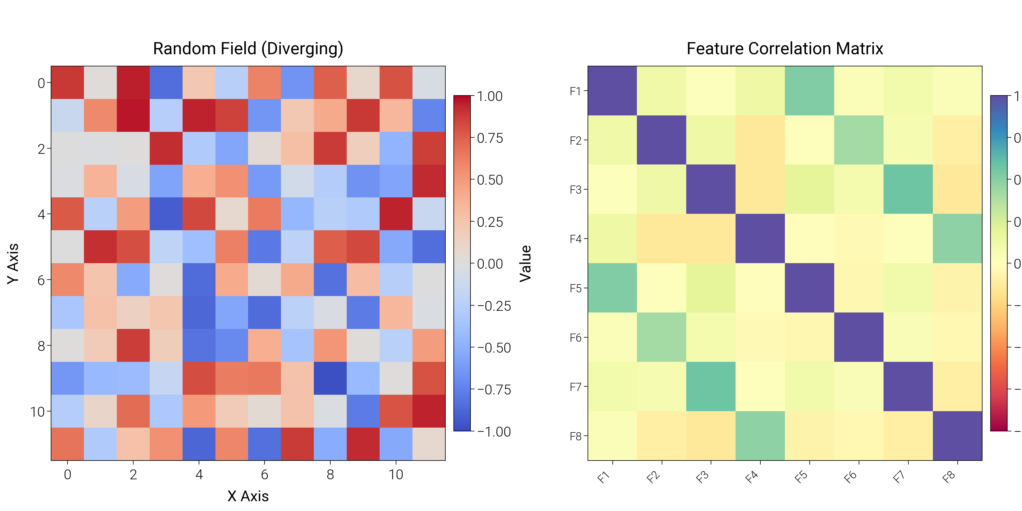
Heatmap
Build heatmaps with annotations, diverging palettes, and tight grids for correlation or matrix data.
import matplotlib.pyplot as plt
import numpy as np

import dartwork_mpl as dm

dm.style.use("scientific")

# Generate data
rng = np.random.default_rng(4)
data = rng.uniform(-1, 1, size=(12, 12))
cov = rng.normal(0, 1, size=(200, 8))
cov[:, 4:] += cov[:, :4] * 0.6  # induce correlation structure
corr = np.corrcoef(cov, rowvar=False)

fig = plt.figure(figsize=(dm.cm2in(18), dm.cm2in(9)), dpi=300)
gs = fig.add_gridspec(
    1,
    2,
    width_ratios=[1, 1],
    left=0.08,
    right=0.94,
    top=0.92,
    bottom=0.12,
    wspace=0.28,
)

# Panel A: Diverging heatmap
ax1 = fig.add_subplot(gs[0, 0])
im1 = ax1.imshow(data, cmap="dm.coolwarm", vmin=-1, vmax=1)
cbar1 = fig.colorbar(im1, ax=ax1, fraction=0.04, pad=0.02)
cbar1.set_label("Value", fontsize=dm.fs(0))
ax1.set_title("Random Field (Diverging)", fontsize=dm.fs(1))
ax1.set_xlabel("X Axis", fontsize=dm.fs(0))
ax1.set_ylabel("Y Axis", fontsize=dm.fs(0))

# Panel B: Correlation matrix
ax2 = fig.add_subplot(gs[0, 1])
im2 = ax2.imshow(corr, cmap="dm.Spectral", vmin=-1, vmax=1)
cbar2 = fig.colorbar(im2, ax=ax2, fraction=0.04, pad=0.02)
cbar2.set_label("Correlation", fontsize=dm.fs(0))
ax2.set_xticks(range(corr.shape[0]))
ax2.set_yticks(range(corr.shape[0]))
ax2.set_xticklabels(
    [f"F{i + 1}" for i in range(corr.shape[0])],
    fontsize=dm.fs(-2),
    rotation=45,
    ha="right",
)
ax2.set_yticklabels(
    [f"F{i + 1}" for i in range(corr.shape[0])], fontsize=dm.fs(-2)
)
ax2.set_title("Feature Correlation Matrix", fontsize=dm.fs(1))

dm.simple_layout(fig, gs=gs)
plt.show()
Total running time of the script: (0 minutes 2.188 seconds)