Note
Go to the end to download the full example code.
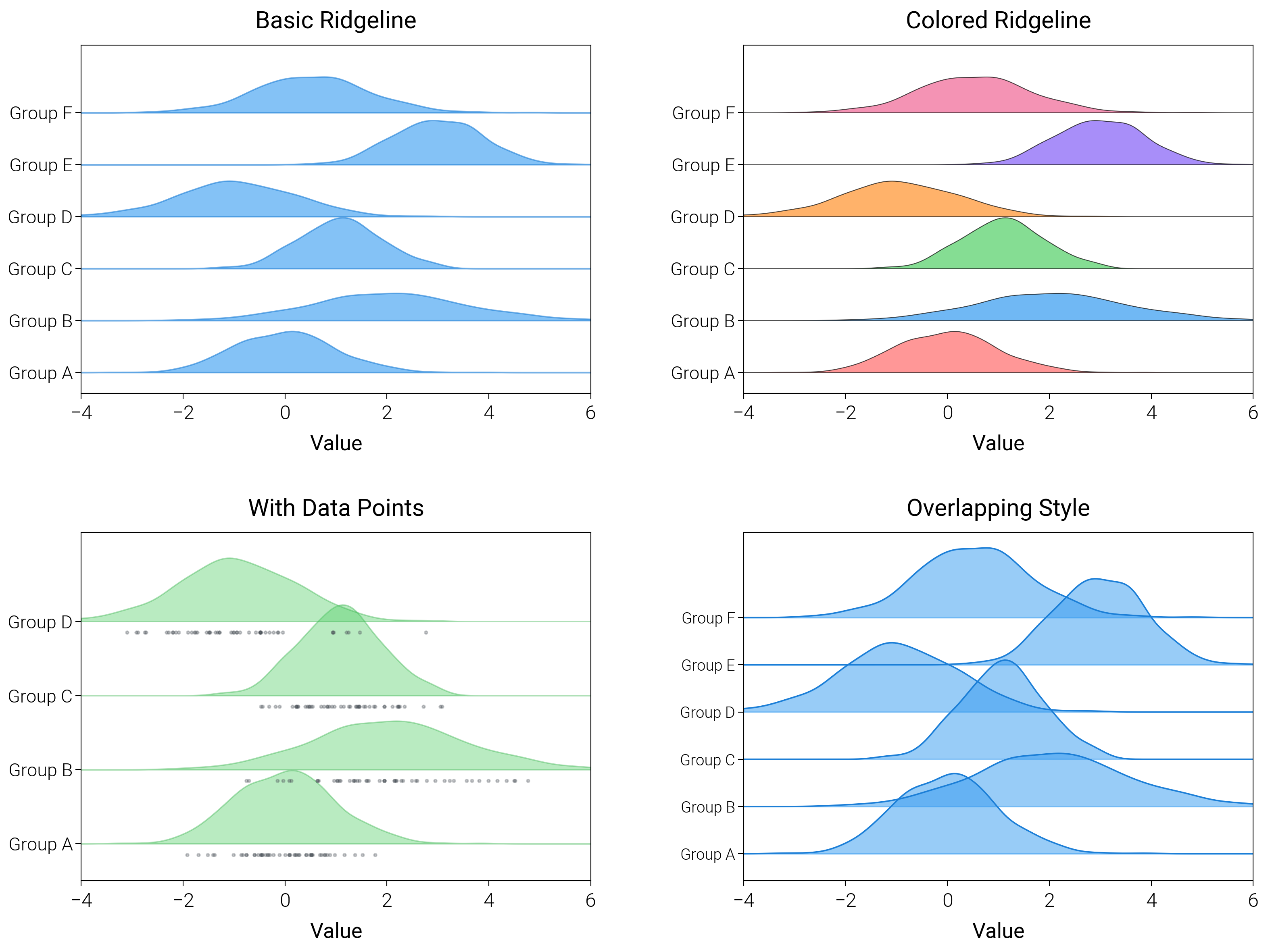
Ridgeline Plots
Use ridgeline (joy) plots with baseline offsets and smooth fills to compare distributions across categories.
import matplotlib.pyplot as plt
import numpy as np
from scipy import stats

import dartwork_mpl as dm

dm.style.use("scientific")

np.random.seed(42)

# Generate data for different categories
categories = ["Group A", "Group B", "Group C", "Group D", "Group E", "Group F"]
data = [
    np.random.normal(0, 1, 500),
    np.random.normal(2, 1.5, 500),
    np.random.normal(1, 0.8, 500),
    np.random.normal(-1, 1.2, 500),
    np.random.normal(3, 0.9, 500),
    np.random.normal(0.5, 1.1, 500),
]

fig = plt.figure(figsize=(dm.cm2in(16), dm.cm2in(12)), dpi=300)
gs = fig.add_gridspec(
    nrows=2,
    ncols=2,
    left=0.12,
    right=0.98,
    top=0.95,
    bottom=0.08,
    wspace=0.3,
    hspace=0.4,
)

# Panel A: Basic ridgeline
ax1 = fig.add_subplot(gs[0, 0])
x_range = np.linspace(-4, 6, 200)
for i, (d, _cat) in enumerate(zip(data, categories, strict=False)):
    kde = stats.gaussian_kde(d)
    y = kde(x_range)
    ax1.fill_between(
        x_range,
        i,
        i + y * 2,
        color="oc.blue5",
        alpha=0.6,
        edgecolor="oc.blue7",
        linewidth=0.5,
    )
ax1.set_yticks(range(len(categories)))
ax1.set_yticklabels(categories, fontsize=dm.fs(-1))
ax1.set_ylim(-0.4, len(categories) + 0.3)
ax1.set_xlabel("Value", fontsize=dm.fs(0))
ax1.set_title("Basic Ridgeline", fontsize=dm.fs(1))
ax1.set_xlim(-4, 6)

# Panel B: Colored ridgeline
ax2 = fig.add_subplot(gs[0, 1])
colors = [
    "oc.red5",
    "oc.blue5",
    "oc.green5",
    "oc.orange5",
    "oc.violet5",
    "oc.pink5",
]
for i, (d, _cat, c) in enumerate(zip(data, categories, colors, strict=False)):
    kde = stats.gaussian_kde(d)
    y = kde(x_range)
    ax2.fill_between(
        x_range,
        i,
        i + y * 2,
        color=c,
        alpha=0.7,
        edgecolor="black",
        linewidth=0.3,
    )
ax2.set_yticks(range(len(categories)))
ax2.set_yticklabels(categories, fontsize=dm.fs(-1))
ax2.set_ylim(-0.4, len(categories) + 0.3)
ax2.set_xlabel("Value", fontsize=dm.fs(0))
ax2.set_title("Colored Ridgeline", fontsize=dm.fs(1))
ax2.set_xlim(-4, 6)

# Panel C: With data points
ax3 = fig.add_subplot(gs[1, 0])
for i, (d, _cat) in enumerate(zip(data[:4], categories[:4], strict=False)):
    kde = stats.gaussian_kde(d)
    y = kde(x_range)
    ax3.fill_between(
        x_range,
        i,
        i + y * 2.5,
        color="oc.green5",
        alpha=0.4,
        edgecolor="oc.green7",
        linewidth=0.5,
    )
    # Add sample points
    sample = np.random.choice(d, 50)
    ax3.scatter(
        sample,
        np.ones(len(sample)) * i - 0.15,
        s=1,
        alpha=0.3,
        color="oc.gray7",
    )
ax3.set_yticks(range(4))
ax3.set_yticklabels(categories[:4], fontsize=dm.fs(-1))
ax3.set_ylim(-0.5, 4.2)
ax3.set_xlabel("Value", fontsize=dm.fs(0))
ax3.set_title("With Data Points", fontsize=dm.fs(1))
ax3.set_xlim(-4, 6)

# Panel D: Overlapping ridgeline
ax4 = fig.add_subplot(gs[1, 1])
for i, (d, _cat) in enumerate(zip(data, categories, strict=False)):
    kde = stats.gaussian_kde(d)
    y = kde(x_range)
    ax4.plot(x_range, i * 0.7 + y * 3, color="oc.blue7", lw=0.5)
    ax4.fill_between(
        x_range, i * 0.7, i * 0.7 + y * 3, color="oc.blue5", alpha=0.5
    )
ax4.set_yticks(np.arange(len(categories)) * 0.7)
ax4.set_yticklabels(categories, fontsize=dm.fs(-2))
ax4.set_ylim(-0.4, 0.7 * (len(categories) + 0.8))
ax4.set_xlabel("Value", fontsize=dm.fs(0))
ax4.set_title("Overlapping Style", fontsize=dm.fs(1))
ax4.set_xlim(-4, 6)

dm.simple_layout(fig, gs=gs)
plt.show()
Total running time of the script: (0 minutes 1.857 seconds)