Note
Go to the end to download the full example code.
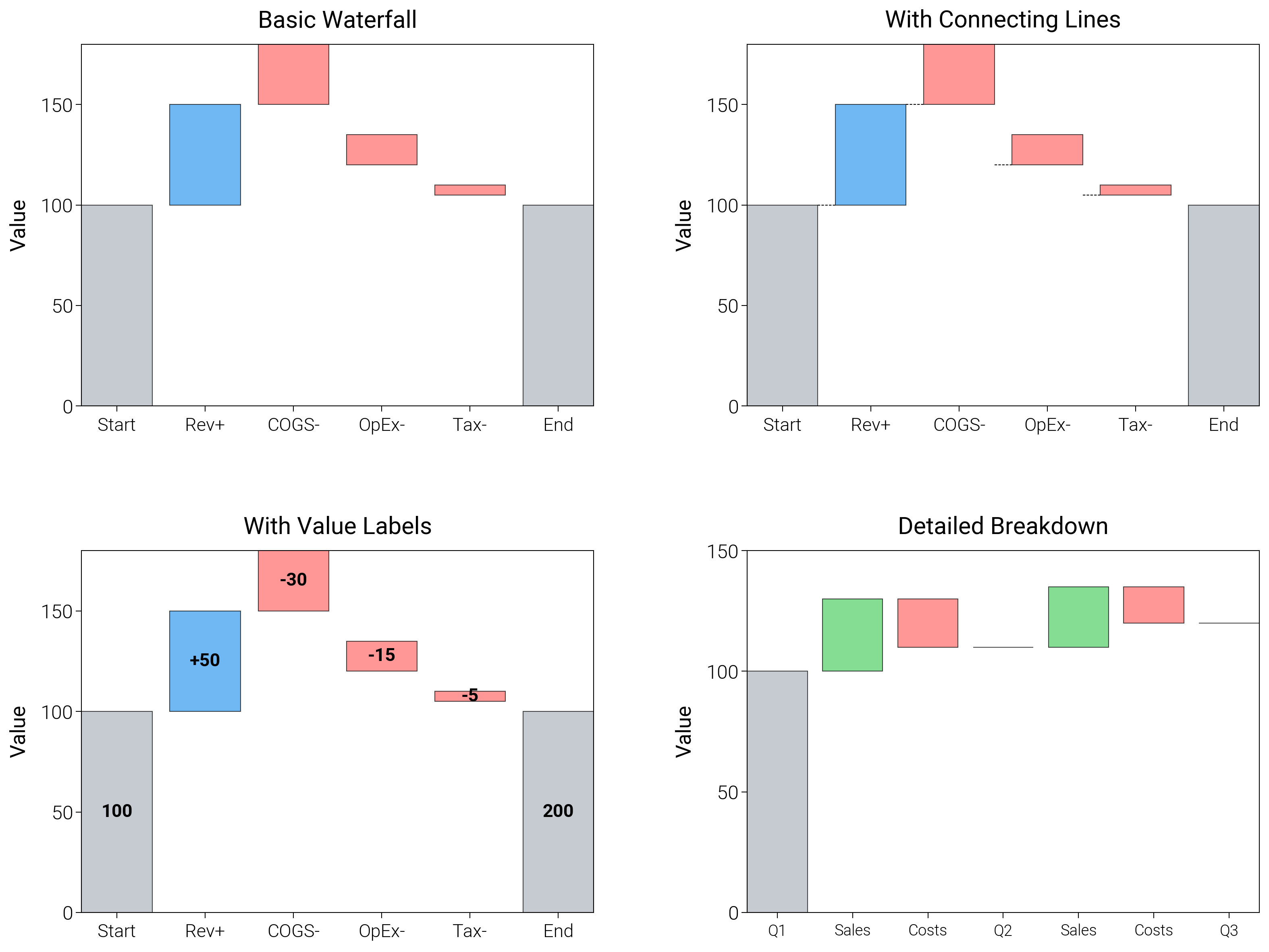
Waterfall Charts
Walk through stepwise gains and losses with helper lines and colors that keep running totals obvious.
import matplotlib.pyplot as plt
import numpy as np

import dartwork_mpl as dm

# Apply scientific style preset
dm.style.use("scientific")

# Sample data for financial waterfall
categories = ["Start", "Rev+", "COGS-", "OpEx-", "Tax-", "End"]
values = [100, 50, -30, -15, -5, 100]  # End = Start + sum of changes
cumulative = np.cumsum(values)

# Create figure
# Double column figure: 17cm width, 2x2 layout
fig = plt.figure(figsize=(dm.cm2in(16), dm.cm2in(12)), dpi=300)

# Create GridSpec for 2x2 subplots
gs = fig.add_gridspec(
    nrows=2,
    ncols=2,
    left=0.12,
    right=0.98,
    top=0.95,
    bottom=0.08,
    wspace=0.3,
    hspace=0.4,
)

# Panel A: Basic waterfall
ax1 = fig.add_subplot(gs[0, 0])
x_pos = np.arange(len(categories))
colors = ["oc.blue5" if v >= 0 else "oc.red5" for v in values]
colors[0] = "oc.gray5"  # Start
colors[-1] = "oc.gray5"  # End
# Calculate bottom positions
bottom = np.zeros(len(categories))
bottom[1:] = cumulative[:-1]
bottom[-1] = 0  # End bar starts from 0
ax1.bar(
    x_pos,
    np.abs(values),
    bottom=bottom,
    color=colors,
    alpha=0.7,
    edgecolor="black",
    linewidth=0.3,
)
ax1.set_xticks(x_pos)
ax1.set_xticklabels(categories, fontsize=dm.fs(-1))
ax1.set_ylabel("Value", fontsize=dm.fs(0))
ax1.set_title("Basic Waterfall", fontsize=dm.fs(1))
ax1.set_yticks([0, 50, 100, 150])

# Panel B: With connecting lines
ax2 = fig.add_subplot(gs[0, 1])
ax2.bar(
    x_pos,
    np.abs(values),
    bottom=bottom,
    color=colors,
    alpha=0.7,
    edgecolor="black",
    linewidth=0.3,
)
# Add connecting lines
for i in range(len(categories) - 1):
    if i < len(categories) - 2:
        ax2.plot(
            [x_pos[i] + 0.4, x_pos[i + 1] - 0.4],
            [cumulative[i], cumulative[i]],
            "k--",
            lw=0.3,
        )
ax2.set_xticks(x_pos)
ax2.set_xticklabels(categories, fontsize=dm.fs(-1))
ax2.set_ylabel("Value", fontsize=dm.fs(0))
ax2.set_title("With Connecting Lines", fontsize=dm.fs(1))
ax2.set_yticks([0, 50, 100, 150])

# Panel C: With value labels
ax3 = fig.add_subplot(gs[1, 0])
bars = ax3.bar(
    x_pos,
    np.abs(values),
    bottom=bottom,
    color=colors,
    alpha=0.7,
    edgecolor="black",
    linewidth=0.3,
)
# Add value labels
for i, (_bar, val) in enumerate(zip(bars, values, strict=False)):
    if i in [0, len(values) - 1]:
        label = f"{cumulative[i]:.0f}"
    else:
        label = f"{val:+.0f}"
    height = bottom[i] + np.abs(val) / 2
    ax3.text(
        x_pos[i],
        height,
        label,
        ha="center",
        va="center",
        fontsize=dm.fs(-1),
        fontweight="bold",
    )
ax3.set_xticks(x_pos)
ax3.set_xticklabels(categories, fontsize=dm.fs(-1))
ax3.set_ylabel("Value", fontsize=dm.fs(0))
ax3.set_title("With Value Labels", fontsize=dm.fs(1))
ax3.set_yticks([0, 50, 100, 150])

# Panel D: Detailed breakdown
ax4 = fig.add_subplot(gs[1, 1])
detailed_cats = ["Q1", "Sales", "Costs", "Q2", "Sales", "Costs", "Q3"]
detailed_vals = [100, 30, -20, 0, 25, -15, 0]
detailed_cum = [100, 130, 110, 110, 135, 120, 120]
x_detailed = np.arange(len(detailed_cats))
detailed_colors = [
    "oc.gray5",
    "oc.green5",
    "oc.red5",
    "oc.gray5",
    "oc.green5",
    "oc.red5",
    "oc.gray5",
]
detailed_bottom = np.zeros(len(detailed_cats))
for i in range(1, len(detailed_cats)):
    if detailed_vals[i] >= 0:
        detailed_bottom[i] = detailed_cum[i - 1]
    else:
        detailed_bottom[i] = detailed_cum[i]
ax4.bar(
    x_detailed,
    np.abs(detailed_vals),
    bottom=detailed_bottom,
    color=detailed_colors,
    alpha=0.7,
    edgecolor="black",
    linewidth=0.3,
)
ax4.set_xticks(x_detailed)
ax4.set_xticklabels(detailed_cats, fontsize=dm.fs(-2))
ax4.set_ylabel("Value", fontsize=dm.fs(0))
ax4.set_title("Detailed Breakdown", fontsize=dm.fs(1))
ax4.set_yticks([0, 50, 100, 150])

# Optimize layout
dm.simple_layout(fig, gs=gs)

# Save and show plot
plt.show()
Total running time of the script: (0 minutes 1.317 seconds)