Note
Go to the end to download the full example code.
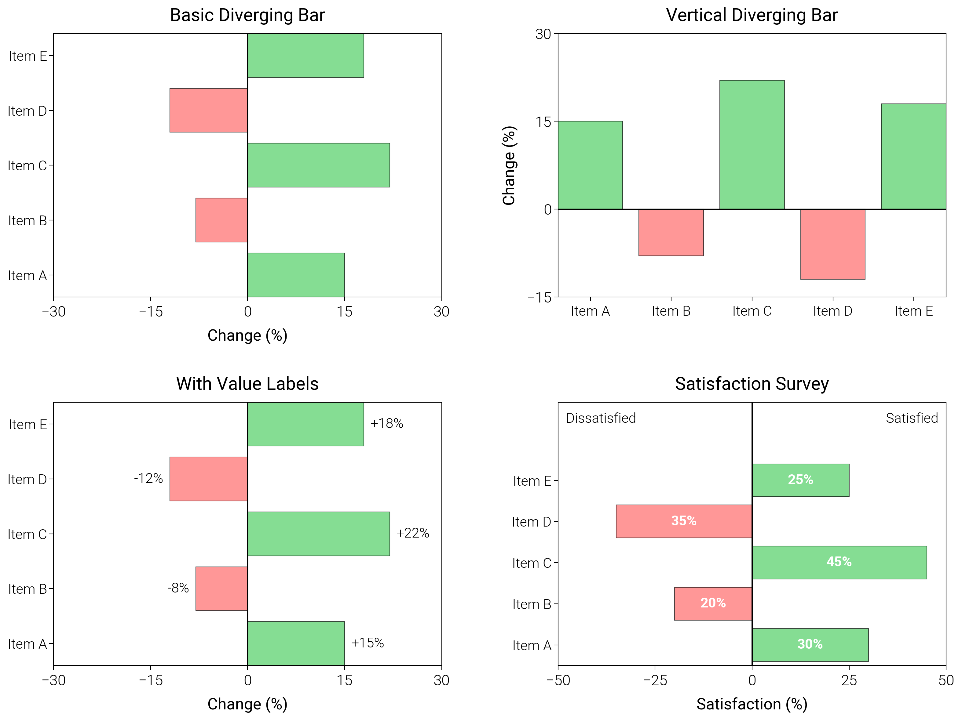
Diverging Bar Charts
Show positive and negative swings around a midpoint with color cues for direction.
import matplotlib.pyplot as plt
import numpy as np

import dartwork_mpl as dm

# Apply scientific style preset
dm.style.use("scientific")

# Sample data
categories = ["Item A", "Item B", "Item C", "Item D", "Item E"]
values = np.array([15, -8, 22, -12, 18])
satisfaction = np.array([30, -20, 45, -35, 25])

# Create figure
# Double column figure: 17cm width, 2x2 layout
fig = plt.figure(figsize=(dm.cm2in(16), dm.cm2in(12)), dpi=300)

# Create GridSpec for 2x2 subplots
gs = fig.add_gridspec(
    nrows=2,
    ncols=2,
    left=0.15,
    right=0.98,
    top=0.95,
    bottom=0.08,
    wspace=0.3,
    hspace=0.4,
)

# Panel A: Basic diverging bar
ax1 = fig.add_subplot(gs[0, 0])
y_pos = np.arange(len(categories))
colors = ["oc.green5" if v > 0 else "oc.red5" for v in values]
ax1.barh(
    y_pos, values, color=colors, alpha=0.7, edgecolor="black", linewidth=0.3
)
ax1.axvline(x=0, color="black", linewidth=0.5)
ax1.set_xlim(-30, 30)
ax1.set_yticks(y_pos)
ax1.set_yticklabels(categories, fontsize=dm.fs(-1))
ax1.set_xlabel("Change (%)", fontsize=dm.fs(0))
ax1.set_title("Basic Diverging Bar", fontsize=dm.fs(1))
ax1.set_xticks([-30, -15, 0, 15, 30])

# Panel B: Vertical diverging bar
ax2 = fig.add_subplot(gs[0, 1])
x_pos = np.arange(len(categories))
ax2.bar(
    x_pos, values, color=colors, alpha=0.7, edgecolor="black", linewidth=0.3
)
ax2.axhline(y=0, color="black", linewidth=0.5)
ax2.set_xticks(x_pos)
ax2.set_xticklabels(categories, fontsize=dm.fs(-1))
ax2.set_ylabel("Change (%)", fontsize=dm.fs(0))
ax2.set_title("Vertical Diverging Bar", fontsize=dm.fs(1))
ax2.set_yticks([-15, 0, 15, 30])

# Panel C: With value labels
ax3 = fig.add_subplot(gs[1, 0])
bars = ax3.barh(
    y_pos, values, color=colors, alpha=0.7, edgecolor="black", linewidth=0.3
)
ax3.axvline(x=0, color="black", linewidth=0.5)
ax3.set_xlim(-30, 30)
# Add value labels
for i, (_bar, val) in enumerate(zip(bars, values, strict=False)):
    x_pos_label = val + (1 if val > 0 else -1)
    ha = "left" if val > 0 else "right"
    ax3.text(
        x_pos_label, i, f"{val:+.0f}%", va="center", ha=ha, fontsize=dm.fs(-1)
    )
ax3.set_yticks(y_pos)
ax3.set_yticklabels(categories, fontsize=dm.fs(-1))
ax3.set_xlabel("Change (%)", fontsize=dm.fs(0))
ax3.set_title("With Value Labels", fontsize=dm.fs(1))
ax3.set_xticks([-30, -15, 0, 15, 30])

# Panel D: Satisfaction survey style
ax4 = fig.add_subplot(gs[1, 1])
y_pos_survey = np.arange(len(categories))
colors_survey = ["oc.green5" if v > 0 else "oc.red5" for v in satisfaction]
bars = ax4.barh(
    y_pos_survey,
    satisfaction,
    color=colors_survey,
    alpha=0.7,
    edgecolor="black",
    linewidth=0.3,
)
ax4.axvline(x=0, color="black", linewidth=0.7)
# Add percentage labels on bars
for i, (_bar, val) in enumerate(zip(bars, satisfaction, strict=False)):
    abs_val = abs(val)
    x_label = val / 2
    ax4.text(
        x_label,
        i,
        f"{abs_val}%",
        va="center",
        ha="center",
        fontsize=dm.fs(-1),
        color="white",
        fontweight="bold",
    )
ax4.set_yticks(y_pos_survey)
ax4.set_yticklabels(categories, fontsize=dm.fs(-1))
ax4.set_xlabel("Satisfaction (%)", fontsize=dm.fs(0))
ax4.set_title("Satisfaction Survey", fontsize=dm.fs(1))
ax4.set_xticks([-50, -25, 0, 25, 50])
# Add labels for negative and positive sides
label_y = len(categories) + 0.4
ax4.set_ylim(-0.5, label_y + 0.5)
ax4.text(-48, label_y, "Dissatisfied", fontsize=dm.fs(-1), ha="left")
ax4.text(48, label_y, "Satisfied", fontsize=dm.fs(-1), ha="right")

# Optimize layout
dm.simple_layout(fig, gs=gs)

# Save and show plot
plt.show()
Total running time of the script: (0 minutes 1.518 seconds)