Note
Go to the end to download the full example code.
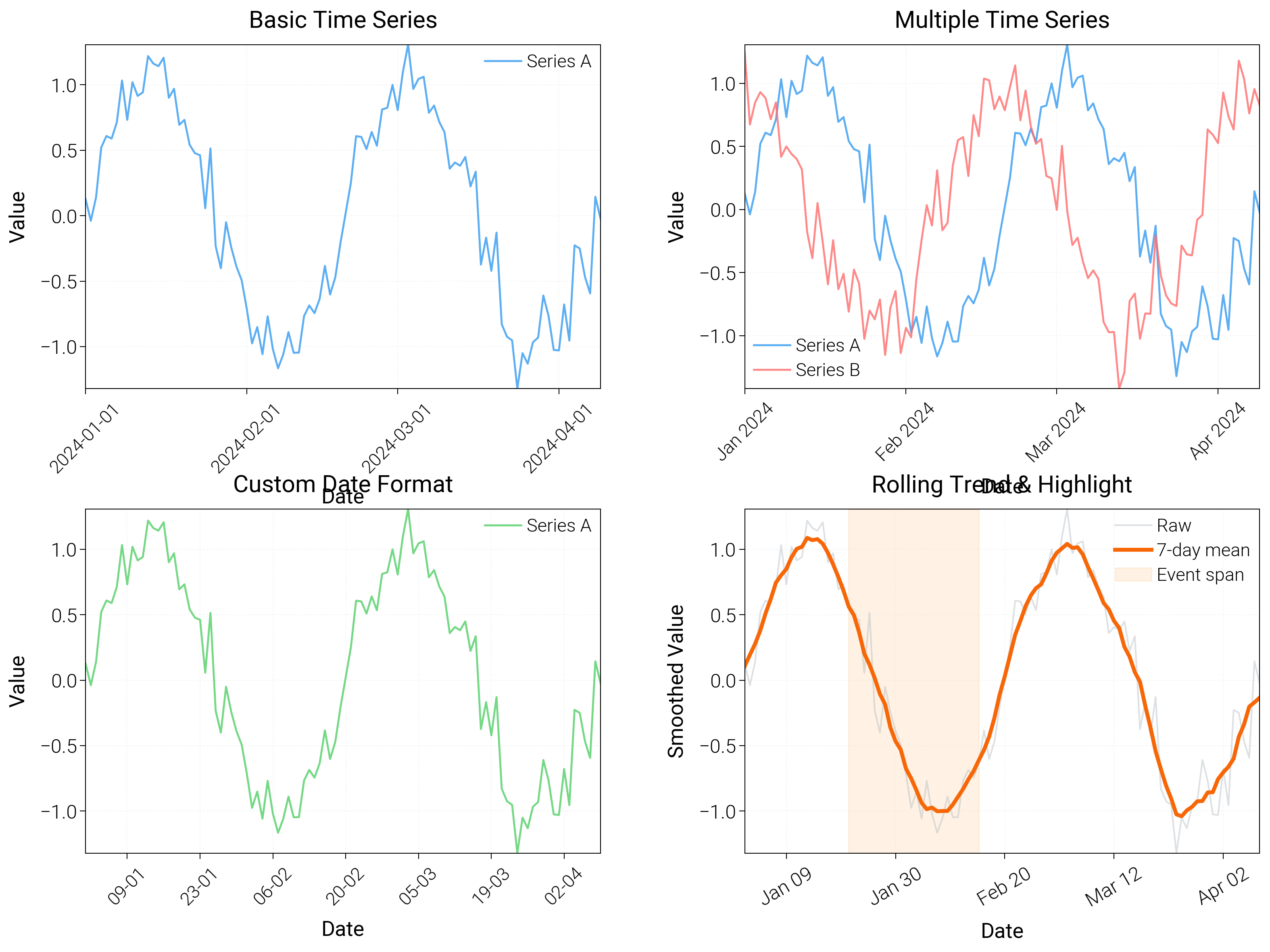
Datetime Plots
Use date-aware axes with rolling trends, spans, and multiple granularities on one canvas.
import locale
from datetime import datetime, timedelta

import matplotlib.dates as mdates
import matplotlib.pyplot as plt
import numpy as np

import dartwork_mpl as dm

# Set locale to 'C' to prevent Korean date formatting
locale.setlocale(locale.LC_TIME, "C")

# Apply scientific style preset
# Default: font.size=7.5, lines.linewidth=0.5, axes.linewidth=0.3
dm.style.use("scientific")

# Generate sample time series data
start_date = datetime(2024, 1, 1)
dates = [start_date + timedelta(days=i) for i in range(100)]
values1 = np.sin(np.linspace(0, 4 * np.pi, 100)) + np.random.randn(100) * 0.2
values2 = np.cos(np.linspace(0, 4 * np.pi, 100)) + np.random.randn(100) * 0.2

# Create figure (square-ish): 16 cm wide, 12 cm tall
fig = plt.figure(figsize=(dm.cm2in(16), dm.cm2in(12)), dpi=300)

# Create GridSpec for 4 subplots (2x2)
gs = fig.add_gridspec(
    nrows=2,
    ncols=2,
    left=0.08,
    right=0.98,
    top=0.92,
    bottom=0.12,
    wspace=0.28,
    hspace=0.35,
)

# Panel A: Basic time series
ax1 = fig.add_subplot(gs[0, 0])
ax1.plot(dates, values1, color="oc.blue5", lw=0.7, label="Series A", alpha=0.8)
# Date formatting: explicit formatter
ax1.xaxis.set_major_formatter(mdates.DateFormatter("%Y-%m-%d"))
ax1.xaxis.set_major_locator(mdates.MonthLocator(interval=1))
ax1.tick_params(axis="x", rotation=45, labelsize=dm.fs(-1))
ax1.set_xlabel("Date", fontsize=dm.fs(0))
ax1.set_ylabel("Value", fontsize=dm.fs(0))
ax1.set_title("Basic Time Series", fontsize=dm.fs(1))
ax1.legend(loc="best", fontsize=dm.fs(-1), ncol=1)
ax1.grid(True, linestyle="--", linewidth=0.3, alpha=0.3)

# Panel B: Multiple time series
ax2 = fig.add_subplot(gs[0, 1])
ax2.plot(dates, values1, color="oc.blue5", lw=0.7, label="Series A", alpha=0.8)
ax2.plot(dates, values2, color="oc.red5", lw=0.7, label="Series B", alpha=0.8)
# Date formatting: month abbreviation
ax2.xaxis.set_major_formatter(mdates.DateFormatter("%b %Y"))
ax2.xaxis.set_major_locator(mdates.MonthLocator(interval=1))
ax2.tick_params(axis="x", rotation=45, labelsize=dm.fs(-1))
ax2.set_xlabel("Date", fontsize=dm.fs(0))
ax2.set_ylabel("Value", fontsize=dm.fs(0))
ax2.set_title("Multiple Time Series", fontsize=dm.fs(1))
ax2.legend(loc="best", fontsize=dm.fs(-1), ncol=1)
ax2.grid(True, linestyle="--", linewidth=0.3, alpha=0.3)

# Panel C: Custom date ticks
ax3 = fig.add_subplot(gs[1, 0])
ax3.plot(dates, values1, color="oc.green5", lw=0.7, label="Series A", alpha=0.8)
# Custom date formatting: day-month format
ax3.xaxis.set_major_formatter(mdates.DateFormatter("%d-%m"))
ax3.xaxis.set_major_locator(mdates.WeekdayLocator(interval=2))
ax3.tick_params(axis="x", rotation=45, labelsize=dm.fs(-1))
ax3.set_xlabel("Date", fontsize=dm.fs(0))
ax3.set_ylabel("Value", fontsize=dm.fs(0))
ax3.set_title("Custom Date Format", fontsize=dm.fs(1))
ax3.legend(loc="best", fontsize=dm.fs(-1), ncol=1)
ax3.grid(True, linestyle="--", linewidth=0.3, alpha=0.3)

# Panel D: Rolling mean + span highlighting
ax4 = fig.add_subplot(gs[1, 1])
rolling = np.convolve(values1, np.ones(7) / 7, mode="same")
ax4.plot(dates, values1, color="oc.gray5", lw=0.6, alpha=0.4, label="Raw")
ax4.plot(dates, rolling, color="oc.orange7", lw=1.4, label="7-day mean")
ax4.axvspan(
    dates[20], dates[45], color="oc.orange3", alpha=0.2, label="Event span"
)
ax4.set_xlabel("Date", fontsize=dm.fs(0))
ax4.set_ylabel("Smoothed Value", fontsize=dm.fs(0))
ax4.set_title("Rolling Trend & Highlight", fontsize=dm.fs(1))
ax4.legend(loc="best", fontsize=dm.fs(-1))
ax4.xaxis.set_major_locator(mdates.WeekdayLocator(interval=3))
ax4.xaxis.set_major_formatter(mdates.DateFormatter("%b %d"))
ax4.tick_params(axis="x", rotation=30)
ax4.grid(True, linestyle="--", linewidth=0.3, alpha=0.3)

# Optimize layout
dm.simple_layout(fig, gs=gs)

# Show plot
plt.show()
Total running time of the script: (0 minutes 2.620 seconds)