Note
Go to the end to download the full example code.
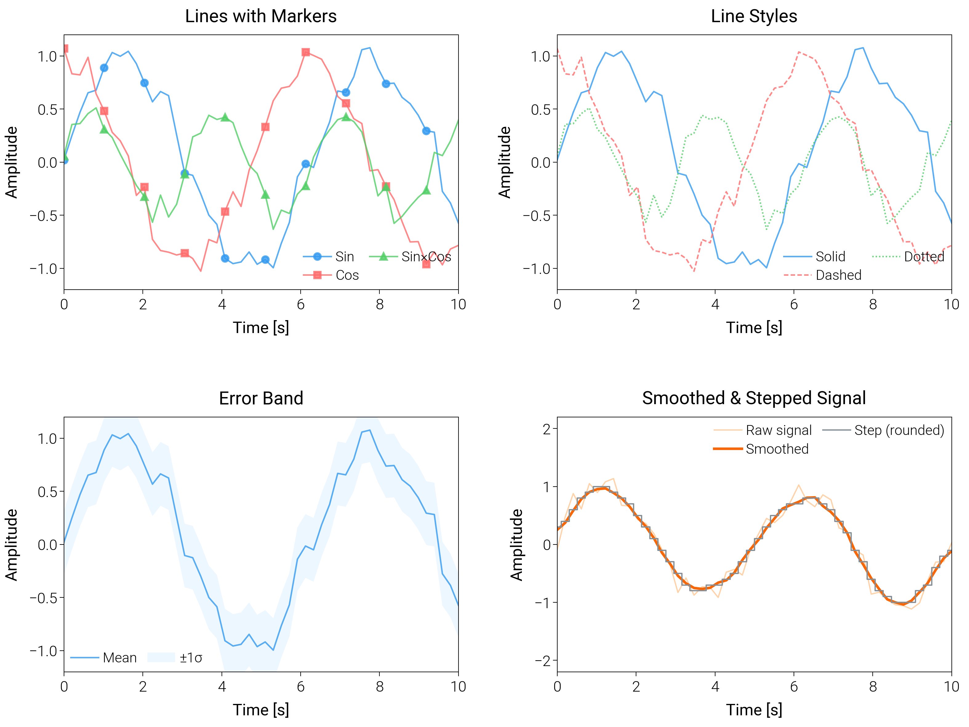
Advanced Line Plots
Compare styling tricks for lines (bands, smoothing, markers) so you can pick a publication-ready look for noisy series.
import matplotlib.pyplot as plt
import numpy as np

import dartwork_mpl as dm

# Apply scientific style preset
# Default: font.size=7.5, lines.linewidth=0.5, axes.linewidth=0.3
dm.style.use("scientific")

# Generate sample data
x = np.linspace(0, 10, 50)
y1 = np.sin(x) + 0.1 * np.random.randn(len(x))
y2 = np.cos(x) + 0.1 * np.random.randn(len(x))
y3 = np.sin(x) * np.cos(x) + 0.1 * np.random.randn(len(x))
y4 = np.sin(0.4 * np.pi * x) + 0.15 * np.random.randn(len(x))

# Error band data
y_upper = y1 + 0.3
y_lower = y1 - 0.3

# Create figure (square-ish): 16 cm wide, 12 cm tall
fig = plt.figure(figsize=(dm.cm2in(16), dm.cm2in(12)), dpi=300)

# Create GridSpec for 4 subplots (2x2)
gs = fig.add_gridspec(
    nrows=2,
    ncols=2,
    left=0.08,
    right=0.98,
    top=0.92,
    bottom=0.12,
    wspace=0.25,
    hspace=0.5,
)

# Panel A: Multiple lines with markers
ax1 = fig.add_subplot(gs[0, 0])
# Explicit parameters: lw=0.7, markersize=3, markevery=5
ax1.plot(
    x,
    y1,
    color="oc.blue5",
    lw=0.7,
    marker="o",
    markersize=3,
    markevery=5,
    label="Sin",
    alpha=0.8,
)
ax1.plot(
    x,
    y2,
    color="oc.red5",
    lw=0.7,
    marker="s",
    markersize=3,
    markevery=5,
    label="Cos",
    alpha=0.8,
)
ax1.plot(
    x,
    y3,
    color="oc.green5",
    lw=0.7,
    marker="^",
    markersize=3,
    markevery=5,
    label="Sin×Cos",
    alpha=0.8,
)
ax1.set_xlabel("Time [s]", fontsize=dm.fs(0))
ax1.set_ylabel("Amplitude", fontsize=dm.fs(0))
ax1.set_title("Lines with Markers", fontsize=dm.fs(1))
ax1.legend(loc="best", fontsize=dm.fs(-1), ncol=2, frameon=False)
# Set explicit ticks
ax1.set_xticks([0, 2, 4, 6, 8, 10])
ax1.set_yticks([-1, -0.5, 0, 0.5, 1])
ax1.set_ylim(-1.2, 1.2)

# Panel B: Different line styles
ax2 = fig.add_subplot(gs[0, 1])
# Explicit parameters: lw=0.7 for all lines
ax2.plot(
    x, y1, color="oc.blue5", lw=0.7, linestyle="-", label="Solid", alpha=0.8
)
ax2.plot(
    x, y2, color="oc.red5", lw=0.7, linestyle="--", label="Dashed", alpha=0.8
)
ax2.plot(
    x, y3, color="oc.green5", lw=0.7, linestyle=":", label="Dotted", alpha=0.8
)
ax2.set_xlabel("Time [s]", fontsize=dm.fs(0))
ax2.set_ylabel("Amplitude", fontsize=dm.fs(0))
ax2.set_title("Line Styles", fontsize=dm.fs(1))
ax2.legend(loc="best", fontsize=dm.fs(-1), ncol=2, frameon=False)
# Set explicit ticks
ax2.set_xticks([0, 2, 4, 6, 8, 10])
ax2.set_yticks([-1, -0.5, 0, 0.5, 1])
ax2.set_ylim(-1.2, 1.2)

# Panel C: Line with error band
ax3 = fig.add_subplot(gs[1, 0])
# Main line: lw=0.7
ax3.plot(x, y1, color="oc.blue5", lw=0.7, label="Mean", alpha=0.8)
# Error band: alpha=0.2, edgecolors='none'
ax3.fill_between(
    x,
    y_lower,
    y_upper,
    color="oc.blue2",
    alpha=0.2,
    edgecolors="none",
    label="±1σ",
)
ax3.set_xlabel("Time [s]", fontsize=dm.fs(0))
ax3.set_ylabel("Amplitude", fontsize=dm.fs(0))
ax3.set_title("Error Band", fontsize=dm.fs(1))
ax3.legend(loc="best", fontsize=dm.fs(-1), ncol=2, frameon=False)
# Set explicit ticks
ax3.set_xticks([0, 2, 4, 6, 8, 10])
ax3.set_yticks([-1, -0.5, 0, 0.5, 1])
ax3.set_ylim(-1.2, 1.2)

# Panel D: Smoothed trend with step overlay
ax4 = fig.add_subplot(gs[1, 1])
# Rolling mean (5-point window) for y4
window = 5
kernel = np.ones(window) / window
y4_smooth = np.convolve(y4, kernel, mode="same")
ax4.plot(x, y4, color="oc.orange5", lw=0.6, alpha=0.4, label="Raw signal")
ax4.plot(x, y4_smooth, color="oc.orange7", lw=1.2, label="Smoothed")
ax4.step(
    x,
    np.round(y4_smooth, 1),
    where="mid",
    color="oc.gray6",
    lw=0.6,
    label="Step (rounded)",
)
ax4.set_xlabel("Time [s]", fontsize=dm.fs(0))
ax4.set_ylabel("Amplitude", fontsize=dm.fs(0))
ax4.set_title("Smoothed & Stepped Signal", fontsize=dm.fs(1))
ax4.legend(loc="best", fontsize=dm.fs(-1), ncol=2, frameon=False)
ax4.set_xticks([0, 2, 4, 6, 8, 10])
ax4.set_yticks([-2, -1, 0, 1, 2])
ax4.set_ylim(-2.2, 2.2)

# Optimize layout
dm.simple_layout(fig, gs=gs)

# Show plot
plt.show()
Total running time of the script: (0 minutes 1.955 seconds)