Note
Go to the end to download the full example code.
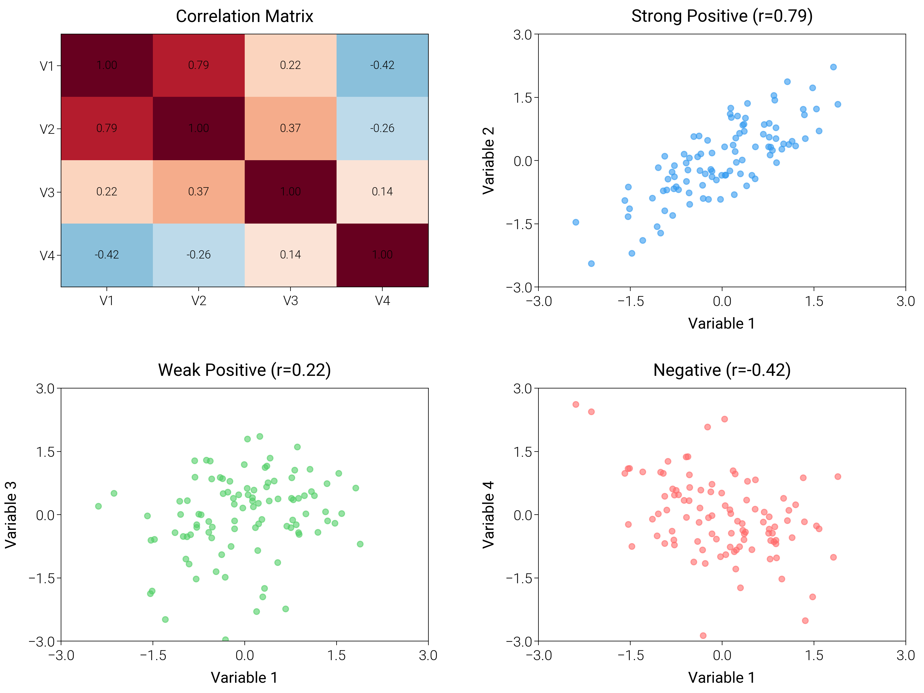
Correlation Matrix
Build correlation heatmaps and scatter matrices with consistent ticks and color mapping to explain relationships quickly.
import matplotlib.pyplot as plt
import numpy as np

import dartwork_mpl as dm

# Apply scientific style preset
dm.style.use("scientific")

# Generate correlated data
np.random.seed(42)
n = 100
mean = [0, 0, 0, 0]
cov = [
    [1.0, 0.8, 0.3, -0.5],
    [0.8, 1.0, 0.5, -0.3],
    [0.3, 0.5, 1.0, 0.1],
    [-0.5, -0.3, 0.1, 1.0],
]
data = np.random.multivariate_normal(mean, cov, n)

# Calculate correlation matrix
corr_matrix = np.corrcoef(data.T)

# Create figure
# Double column figure: 17cm width, 2x2 layout
fig = plt.figure(figsize=(dm.cm2in(16), dm.cm2in(12)), dpi=300)

# Create GridSpec for 2x2 subplots
gs = fig.add_gridspec(
    nrows=2,
    ncols=2,
    left=0.08,
    right=0.98,
    top=0.95,
    bottom=0.08,
    wspace=0.3,
    hspace=0.4,
)

# Panel A: Correlation heatmap
ax1 = fig.add_subplot(gs[0, 0])
im = ax1.imshow(corr_matrix, cmap="RdBu_r", vmin=-1, vmax=1, aspect="auto")
ax1.set_xticks([0, 1, 2, 3])
ax1.set_yticks([0, 1, 2, 3])
ax1.set_xticklabels(["V1", "V2", "V3", "V4"], fontsize=dm.fs(-1))
ax1.set_yticklabels(["V1", "V2", "V3", "V4"], fontsize=dm.fs(-1))
ax1.set_title("Correlation Matrix", fontsize=dm.fs(1))
# Add correlation values as text
for i in range(4):
    for j in range(4):
        text = ax1.text(
            j,
            i,
            f"{corr_matrix[i, j]:.2f}",
            ha="center",
            va="center",
            color="black",
            fontsize=dm.fs(-2),
        )

# Panel B: Scatter plot - strong positive correlation
ax2 = fig.add_subplot(gs[0, 1])
ax2.scatter(data[:, 0], data[:, 1], c="oc.blue5", s=8, alpha=0.6)
ax2.set_xlabel("Variable 1", fontsize=dm.fs(0))
ax2.set_ylabel("Variable 2", fontsize=dm.fs(0))
ax2.set_title(f"Strong Positive (r={corr_matrix[0, 1]:.2f})", fontsize=dm.fs(1))
ax2.set_xticks([-3, -1.5, 0, 1.5, 3])
ax2.set_yticks([-3, -1.5, 0, 1.5, 3])

# Panel C: Scatter plot - weak positive correlation
ax3 = fig.add_subplot(gs[1, 0])
ax3.scatter(data[:, 0], data[:, 2], c="oc.green5", s=8, alpha=0.6)
ax3.set_xlabel("Variable 1", fontsize=dm.fs(0))
ax3.set_ylabel("Variable 3", fontsize=dm.fs(0))
ax3.set_title(f"Weak Positive (r={corr_matrix[0, 2]:.2f})", fontsize=dm.fs(1))
ax3.set_xticks([-3, -1.5, 0, 1.5, 3])
ax3.set_yticks([-3, -1.5, 0, 1.5, 3])

# Panel D: Scatter plot - negative correlation
ax4 = fig.add_subplot(gs[1, 1])
ax4.scatter(data[:, 0], data[:, 3], c="oc.red5", s=8, alpha=0.6)
ax4.set_xlabel("Variable 1", fontsize=dm.fs(0))
ax4.set_ylabel("Variable 4", fontsize=dm.fs(0))
ax4.set_title(f"Negative (r={corr_matrix[0, 3]:.2f})", fontsize=dm.fs(1))
ax4.set_xticks([-3, -1.5, 0, 1.5, 3])
ax4.set_yticks([-3, -1.5, 0, 1.5, 3])

# Optimize layout
dm.simple_layout(fig, gs=gs)

# Save and show plot
plt.show()
Total running time of the script: (0 minutes 1.571 seconds)