Note
Go to the end to download the full example code.
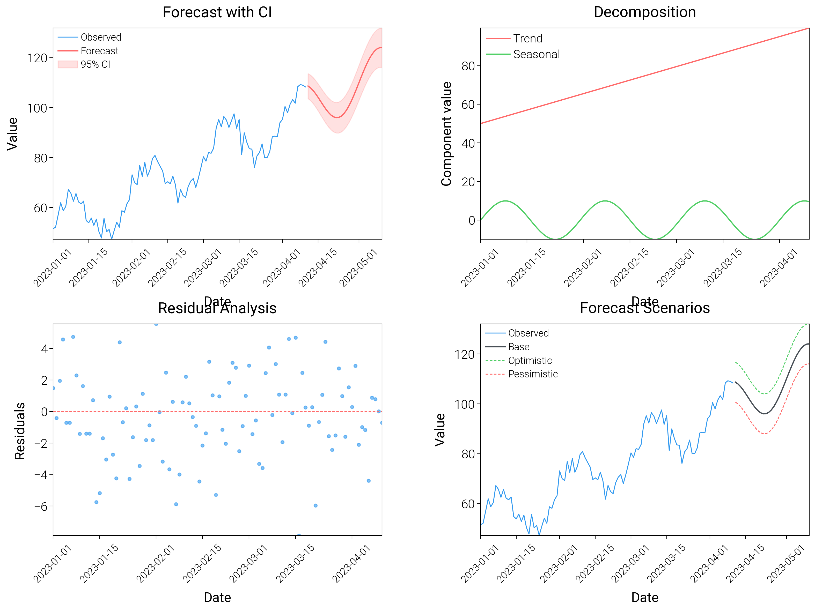
Time Series Forecasting
Show forecasts with past-versus-future shading, ribbons, and quantile fans to communicate uncertainty.
from datetime import datetime, timedelta

import matplotlib.pyplot as plt
import numpy as np

import dartwork_mpl as dm

# Apply scientific style preset
dm.style.use("scientific")

# Generate time series data
np.random.seed(42)
start_date = datetime(2023, 1, 1)
dates = [start_date + timedelta(days=i) for i in range(100)]
dates_future = [start_date + timedelta(days=i) for i in range(100, 130)]

# Historical data with trend and seasonality
t = np.arange(100)
trend = 50 + 0.5 * t
seasonal = 10 * np.sin(2 * np.pi * t / 30)
noise = np.random.normal(0, 3, 100)
observed = trend + seasonal + noise

# Forecast
t_future = np.arange(100, 130)
forecast = 50 + 0.5 * t_future + 10 * np.sin(2 * np.pi * t_future / 30)
forecast_upper = forecast + 5 + 0.1 * (t_future - 100)
forecast_lower = forecast - 5 - 0.1 * (t_future - 100)

# Create figure
fig = plt.figure(figsize=(dm.cm2in(16), dm.cm2in(12)), dpi=300)

# Create GridSpec
gs = fig.add_gridspec(
    nrows=2,
    ncols=2,
    left=0.10,
    right=0.98,
    top=0.95,
    bottom=0.10,
    wspace=0.3,
    hspace=0.4,
)

# Panel A: Forecast with confidence interval
ax1 = fig.add_subplot(gs[0, 0])
ax1.plot(dates, observed, color="oc.blue5", lw=0.5, label="Observed")
ax1.plot(dates_future, forecast, color="oc.red5", lw=0.7, label="Forecast")
ax1.fill_between(
    dates_future,
    forecast_lower,
    forecast_upper,
    color="oc.red5",
    alpha=0.2,
    label="95% CI",
)
ax1.set_xlabel("Date", fontsize=dm.fs(0))
ax1.set_ylabel("Value", fontsize=dm.fs(0))
ax1.set_title("Forecast with CI", fontsize=dm.fs(1))
ax1.legend(loc="best", fontsize=dm.fs(-2))
ax1.tick_params(axis="x", rotation=45, labelsize=dm.fs(-2))

# Panel B: Components decomposition
ax2 = fig.add_subplot(gs[0, 1])
ax2.plot(dates, trend[:100], color="oc.red5", lw=0.7, label="Trend")
ax2.plot(dates, seasonal, color="oc.green5", lw=0.7, label="Seasonal")
ax2.set_xlabel("Date", fontsize=dm.fs(0))
ax2.set_ylabel("Component value", fontsize=dm.fs(0))
ax2.set_title("Decomposition", fontsize=dm.fs(1))
ax2.legend(loc="best", fontsize=dm.fs(-1))
ax2.tick_params(axis="x", rotation=45, labelsize=dm.fs(-2))

# Panel C: Residuals
ax3 = fig.add_subplot(gs[1, 0])
residuals = observed - (trend[:100] + seasonal)
ax3.scatter(dates, residuals, c="oc.blue5", s=3, alpha=0.6)
ax3.axhline(y=0, color="oc.red5", lw=0.5, linestyle="--")
ax3.set_xlabel("Date", fontsize=dm.fs(0))
ax3.set_ylabel("Residuals", fontsize=dm.fs(0))
ax3.set_title("Residual Analysis", fontsize=dm.fs(1))
ax3.tick_params(axis="x", rotation=45, labelsize=dm.fs(-2))

# Panel D: Multiple forecast scenarios
ax4 = fig.add_subplot(gs[1, 1])
forecast_optimistic = forecast + 8
forecast_pessimistic = forecast - 8
ax4.plot(dates, observed, color="oc.blue5", lw=0.5, label="Observed")
ax4.plot(dates_future, forecast, color="oc.gray7", lw=0.7, label="Base")
ax4.plot(
    dates_future,
    forecast_optimistic,
    color="oc.green5",
    lw=0.5,
    linestyle="--",
    label="Optimistic",
)
ax4.plot(
    dates_future,
    forecast_pessimistic,
    color="oc.red5",
    lw=0.5,
    linestyle="--",
    label="Pessimistic",
)
ax4.set_xlabel("Date", fontsize=dm.fs(0))
ax4.set_ylabel("Value", fontsize=dm.fs(0))
ax4.set_title("Forecast Scenarios", fontsize=dm.fs(1))
ax4.legend(loc="best", fontsize=dm.fs(-2))
ax4.tick_params(axis="x", rotation=45, labelsize=dm.fs(-2))

# Optimize layout
dm.simple_layout(fig, gs=gs)

# Save and show plot
plt.show()
Total running time of the script: (0 minutes 3.748 seconds)