Note
Go to the end to download the full example code.
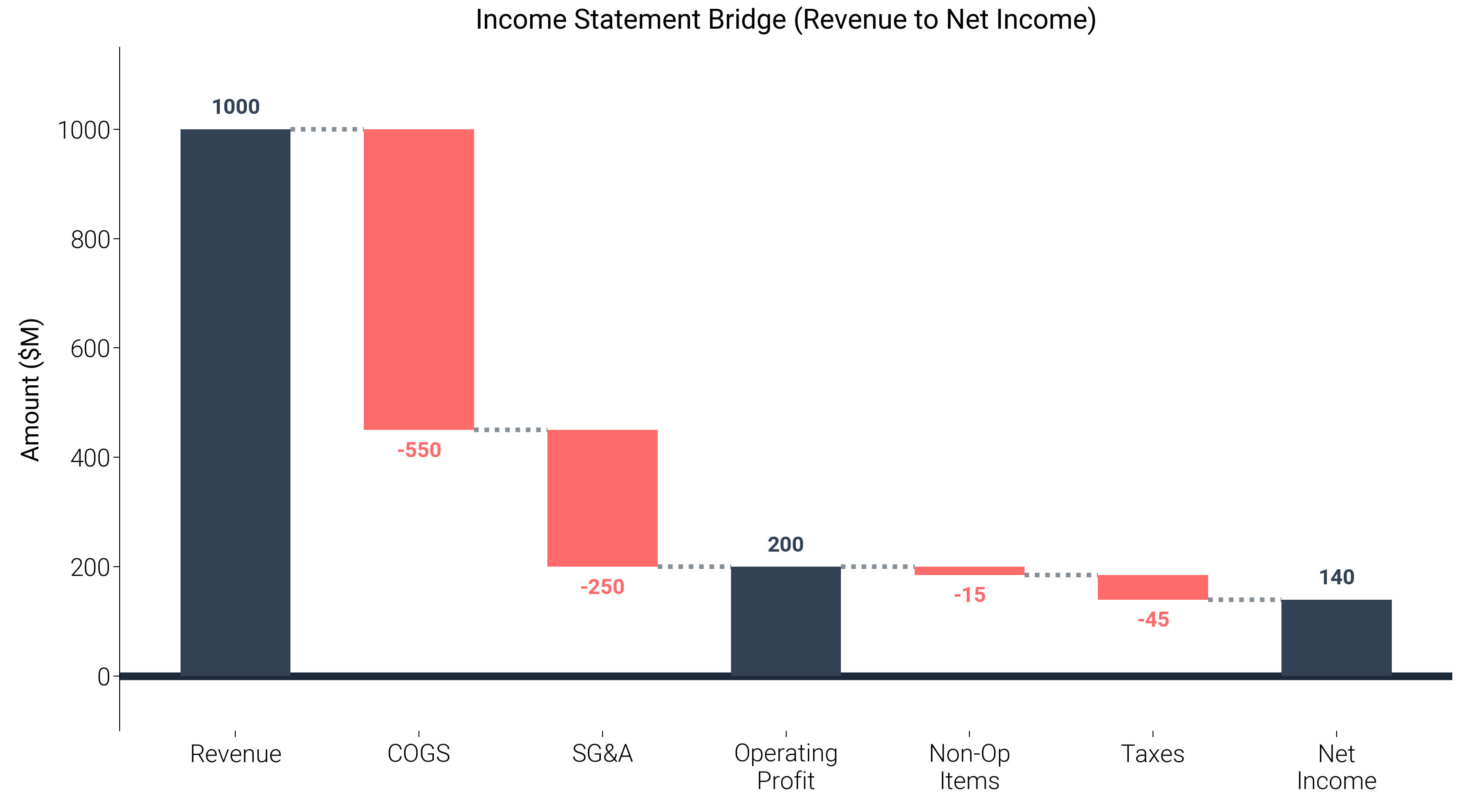
Ultimate Bridge (Waterfall) Chart
A bridge chart (or waterfall chart) is a staple in financial and management reporting
to explain the bridge between two periods (e.g., Year-over-Year profit change).
This example demonstrates how to build a highly polished bridge chart using
dartwork-mpl’s color system (oc.teal5 for positive, oc.red5 for negative),
unobtrusive connector lines, and automated annotations via dm.set_decimal() logic.
import matplotlib.pyplot as plt
import numpy as np

import dartwork_mpl as dm

dm.style.use("report")

# Data Setup
categories = [
    "Revenue",
    "COGS",
    "SG&A",
    "Operating\nProfit",
    "Non-Op\nItems",
    "Taxes",
    "Net\nIncome",
]
values = [1000, -550, -250, 200, -15, -45, 140]
is_total = [True, False, False, True, False, False, True]

# Calculate baselines (bottom of each bar)
baselines = np.zeros(len(values))
current = 0
for i in range(len(values)):
    if is_total[i]:
        # Total bars (Revenue, OP, Net Income)
        baselines[i] = 0
        current = values[i]
    else:
        # Floating bars
        if values[i] >= 0:
            baselines[i] = current
        else:
            baselines[i] = current + values[i]
        current += values[i]

# Determine colors
colors = []
for i, v in enumerate(values):
    if is_total[i]:
        colors.append("tw.slate700")  # Totals
    else:
        colors.append("oc.teal5" if v >= 0 else "oc.red5")

fig, ax = plt.subplots(figsize=(dm.DW, dm.DW * 0.55))

# Plot bars
bars = ax.bar(
    categories,
    np.abs(values),
    bottom=baselines,
    color=colors,
    width=0.6,
    zorder=3,
)

# Add connector lines
current_total = values[0]
for i in range(1, len(values)):
    # Connect right edge of i-1 bar to left edge of i bar
    ax.plot(
        [i - 1 + 0.3, i - 0.3],
        [current_total, current_total],
        color="oc.gray6",
        ls=":",
        lw=dm.lw(0.5),
        zorder=2,
    )
    if is_total[i]:
        current_total = values[i]
    else:
        current_total += values[i]

# Add text annotations directly onto or above the bars
for i, (b, v, _bar) in enumerate(zip(baselines, values, bars, strict=False)):
    # Calculate position: hardcode a fixed offset (~2% of max value)
    offset = 20
    if v >= 0:
        y_pos = b + abs(v) + offset
        va = "bottom"
    else:
        y_pos = b - offset
        va = "top"

    # Format text
    if is_total[i]:
        val_str = str(v)
    else:
        val_str = f"+{v}" if v > 0 else str(v)

    ax.text(
        i,
        y_pos,
        val_str,
        ha="center",
        va=va,
        fontsize=dm.fs(-1),
        fontweight="bold",
        color=colors[i],
    )

# Title and Formatting
ax.set_title("Income Statement Bridge (Revenue to Net Income)")
ax.set_ylabel("Amount ($M)")
dm.set_decimal(ax, yn=0)

# Hide x-axis spine to make it cleaner and draw a solid baseline
ax.spines["bottom"].set_visible(False)
ax.axhline(0, color="tw.slate800", lw=dm.lw(1.5), zorder=1)

# Add top Y-margin to fit annotations
ax.set_ylim(-100, 1150)

dm.simple_layout(fig)
plt.show()
Total running time of the script: (0 minutes 1.466 seconds)