Note
Go to the end to download the full example code.
Content-Aware Auto Layout
This example demonstrates dm.auto_layout() which automatically detects
and fixes text overflow by measuring actual bounding boxes and iteratively
adjusting margins. This is particularly useful for figures with long labels
or multi-line titles that might extend beyond figure boundaries.
import matplotlib.pyplot as plt
import numpy as np

import dartwork_mpl as dm

# Apply scientific style for consistent formatting
dm.style.use("scientific")

# Create figure with potentially problematic layout
fig, (ax1, ax2) = plt.subplots(1, 2, figsize=(dm.cm2in(16), dm.cm2in(8)))

# Generate sample data
x = np.linspace(0, 10, 100)
y1 = np.sin(x) + 0.1 * np.random.randn(100)
y2 = np.cos(x) + 0.1 * np.random.randn(100)

# Left plot with very long labels that would typically overflow
ax1.plot(x, y1, color="oc.blue5", lw=dm.lw(1))
ax1.set_title(
    "Panel A: Demonstration of\nMulti-Line Title with Potential Overflow\nThird Line for Extra Challenge",
    fontsize=dm.fs(1),
)
ax1.set_ylabel(
    "Extremely Long Y-Axis Label\nThat Spans Multiple Lines\n(Units: km/h)",
    fontsize=dm.fs(0),
)
ax1.set_xlabel("Time [seconds]", fontsize=dm.fs(0))

# Right plot with normal labels for comparison
ax2.plot(x, y2, color="oc.red5", lw=dm.lw(1))
ax2.set_title("Panel B: Normal Title", fontsize=dm.fs(1))
ax2.set_ylabel("Value", fontsize=dm.fs(0))
ax2.set_xlabel("Time [seconds]", fontsize=dm.fs(0))

# Add panel labels
dm.label_axes([ax1, ax2])

# Apply auto layout with verbose output to show the iteration process
print("Applying auto_layout to prevent text overflow...")
dm.auto_layout(fig, padding=0.05, max_iter=5, verbose=True)
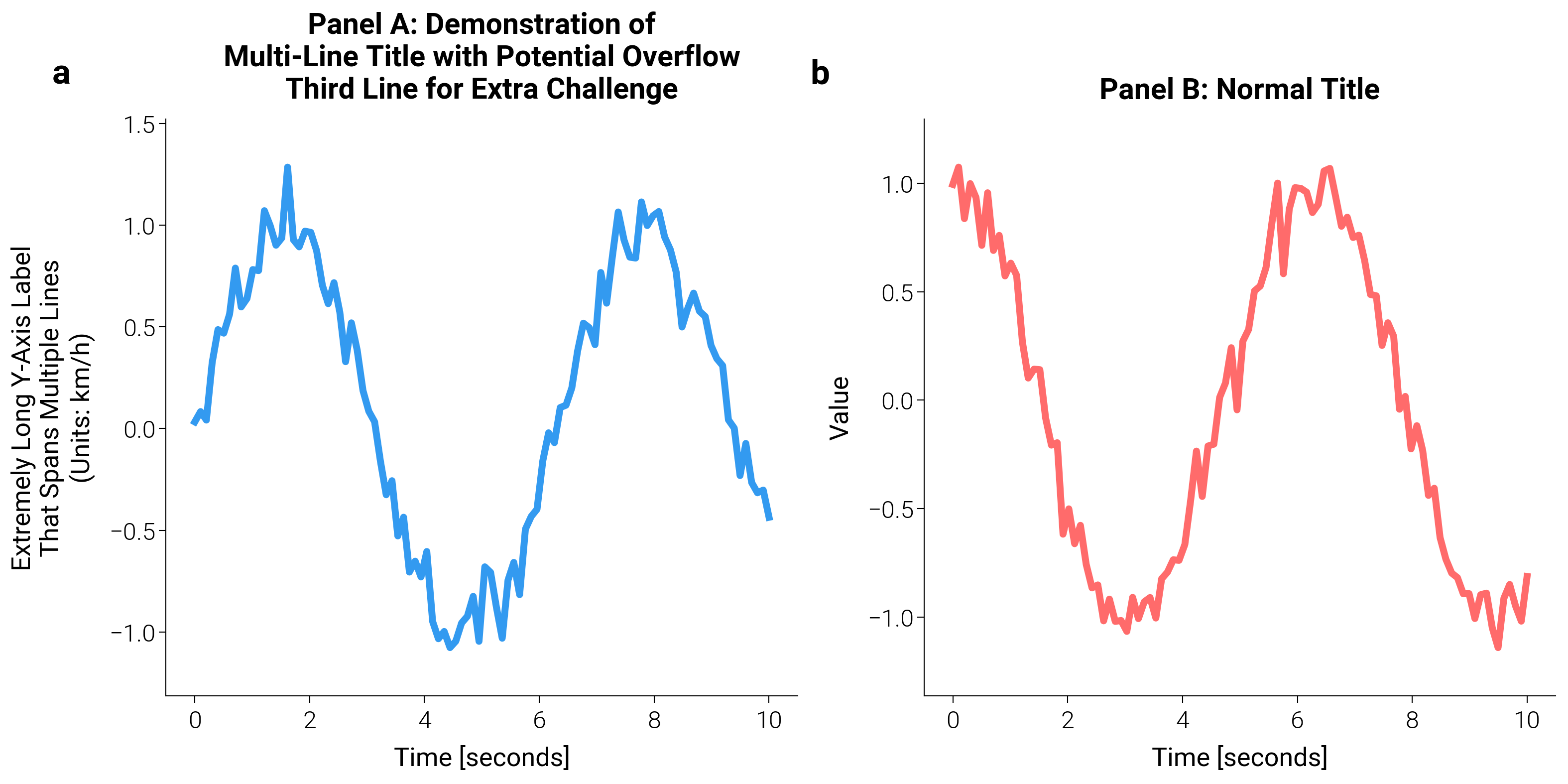
Applying auto_layout to prevent text overflow...
[auto_layout] iter 1: margins=(0.050, 0.050, 0.050, 0.050)  overflow=L:0.0px R:0.0px B:0.0px T:0.0px
[auto_layout] Converged in 1 iteration(s).
The auto_layout function works by:
Initial Layout: Applies minimal margins as a starting point
Overflow Detection: Measures actual bounding boxes of all text elements
Margin Adjustment: Increases margins only where overflow is detected
Iteration: Repeats until no overflow remains or max iterations reached
This ensures that all text remains within the figure bounds without unnecessarily large margins.
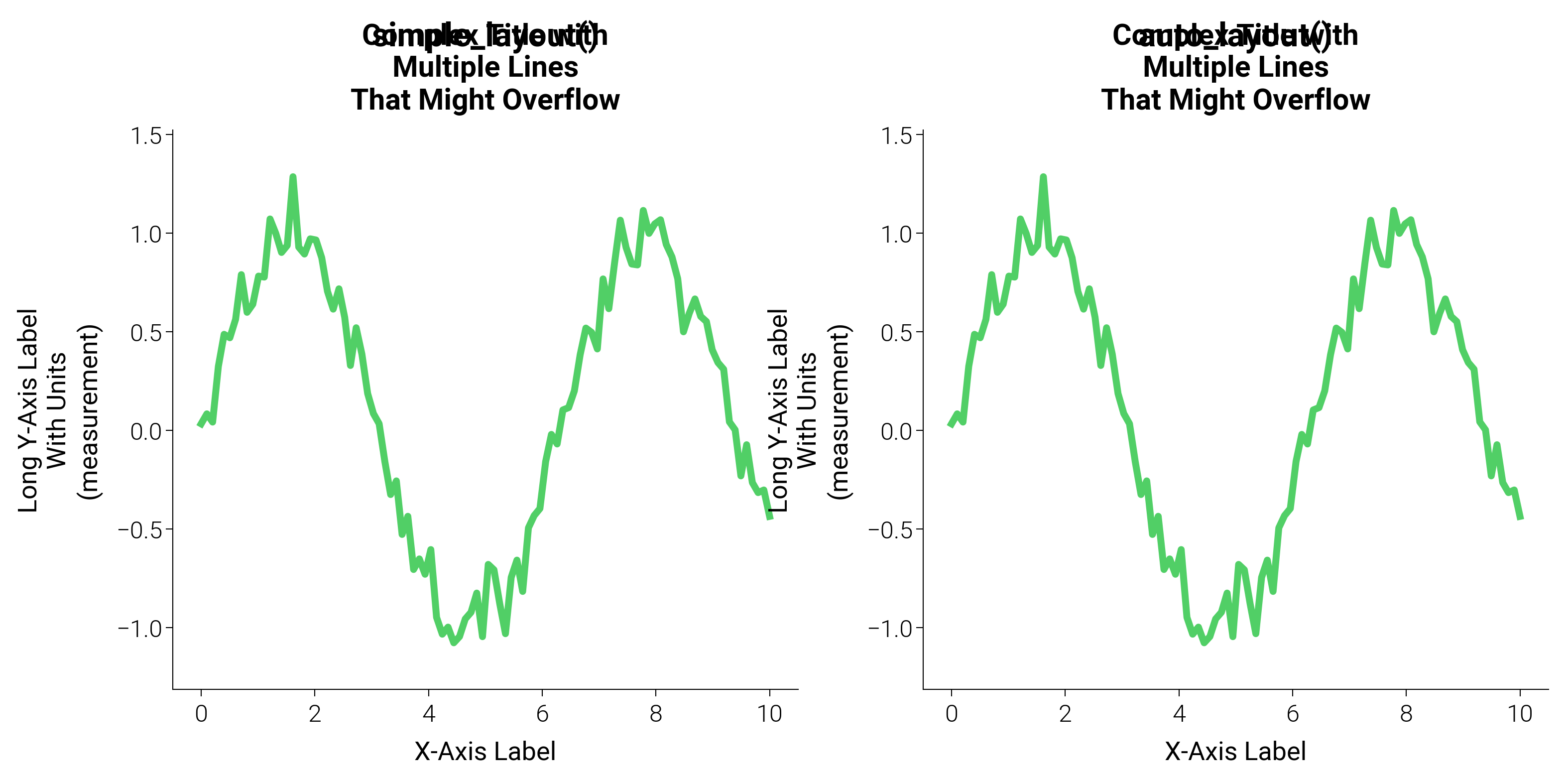
Comparison with simple_layout
fig2, (ax3, ax4) = plt.subplots(1, 2, figsize=(dm.cm2in(16), dm.cm2in(8)))

# Create identical plots
for ax in [ax3, ax4]:
    ax.plot(x, y1, color="oc.green5", lw=dm.lw(1))
    ax.set_title(
        "Complex Title with\nMultiple Lines\nThat Might Overflow",
        fontsize=dm.fs(1),
    )
    ax.set_ylabel(
        "Long Y-Axis Label\nWith Units\n(measurement)", fontsize=dm.fs(0)
    )
    ax.set_xlabel("X-Axis Label", fontsize=dm.fs(0))

ax3.text(
    0.5,
    1.15,
    "simple_layout()",
    transform=ax3.transAxes,
    ha="center",
    fontsize=dm.fs(2),
    weight="bold",
)
ax4.text(
    0.5,
    1.15,
    "auto_layout()",
    transform=ax4.transAxes,
    ha="center",
    fontsize=dm.fs(2),
    weight="bold",
)

# Apply auto_layout for the full figure
dm.auto_layout(fig2)
Advanced Usage
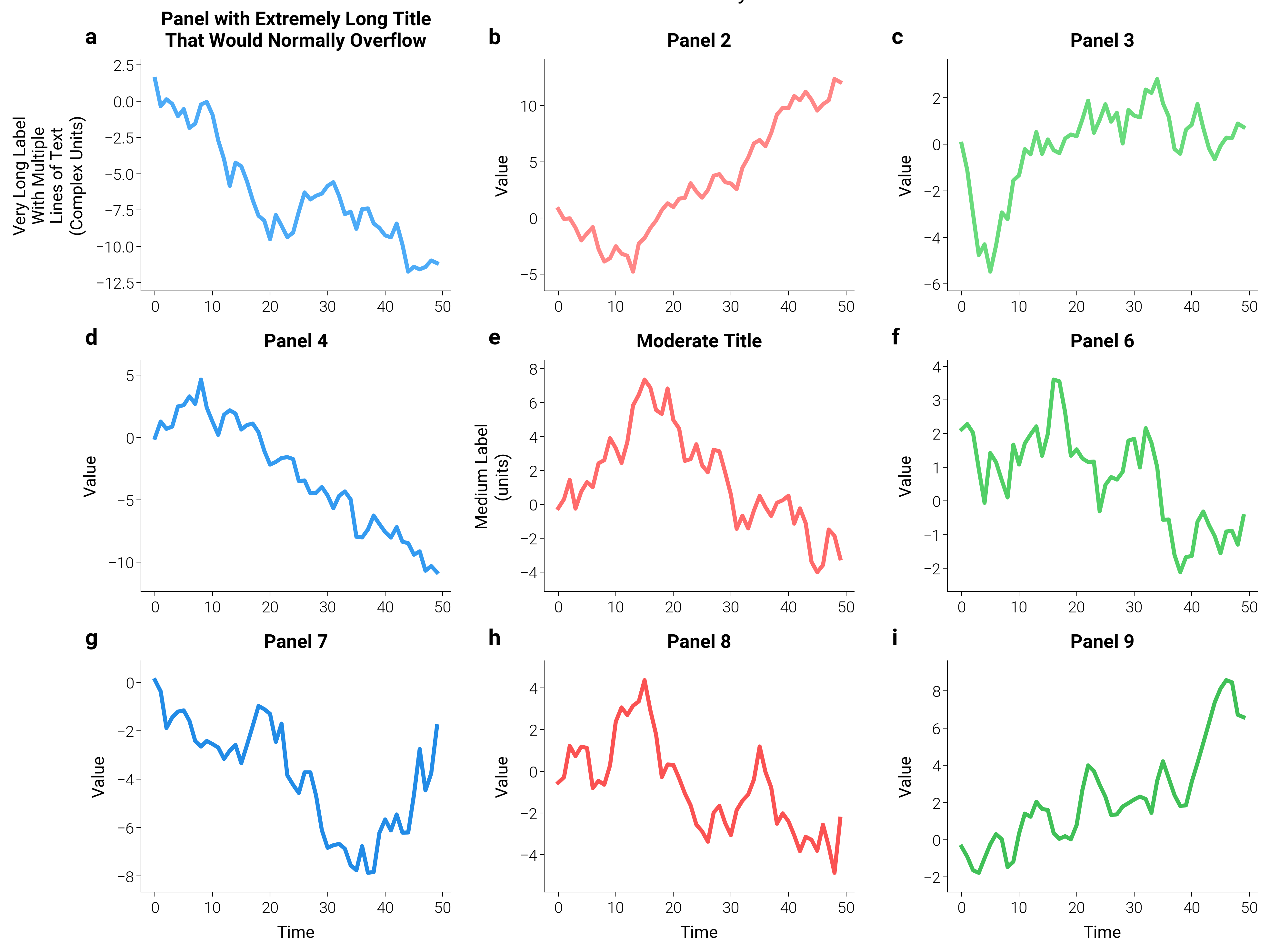
# Create a complex dashboard with varying label lengths
fig3 = plt.figure(figsize=(dm.cm2in(20), dm.cm2in(15)))
gs = fig3.add_gridspec(3, 3, hspace=0.3, wspace=0.3)

# Create subplots with different label complexities
axes = []
for i in range(3):
    for j in range(3):
        ax = fig3.add_subplot(gs[i, j])
        axes.append(ax)

        # Generate random data
        data = np.random.randn(50).cumsum()
        ax.plot(
            data,
            color=f"oc.{['blue', 'red', 'green'][j]}{4 + i}",
            lw=dm.lw(0.8),
        )

        # Vary label complexity
        if i == 0 and j == 0:
            ax.set_ylabel(
                "Very Long Label\nWith Multiple\nLines of Text\n(Complex Units)"
            )
            ax.set_title(
                "Panel with Extremely Long Title\nThat Would Normally Overflow"
            )
        elif i == 1 and j == 1:
            ax.set_ylabel("Medium Label\n(units)")
            ax.set_title("Moderate Title")
        else:
            ax.set_ylabel("Value")
            ax.set_title(f"Panel {i * 3 + j + 1}")

        ax.set_xlabel("Time" if i == 2 else "")

# Add panel labels
dm.label_axes(axes)

# Apply auto layout with custom parameters
dm.auto_layout(
    fig3,
    padding=0.08,  # Minimum padding around text (in inches)
    max_iter=10,  # Maximum iterations to prevent infinite loops
    verbose=False,  # Set to True to see convergence details
)

plt.suptitle("Dashboard with Auto Layout", fontsize=dm.fs(3), y=1.02)
When to Use auto_layout
Recommended for:
Figures with unknown or variable label lengths (e.g., generated by AI)
Multi-line titles or axis labels
Complex dashboards with many panels
Publication figures where text cutoff is unacceptable
Performance Note:
auto_layout is slightly slower than simple_layout due to the
iterative measurement process. For simple figures with predictable
labels, simple_layout is usually sufficient and faster.
plt.show()
Total running time of the script: (0 minutes 11.660 seconds)